One of my besties is getting married in a few weeks - this weekend was both her Bridal Shower and her Bachellorette. While I've never been to a Bridal Shower before, I knew I had to make something for her that would be extra special. I have this die that has been begging me to create with it, it's a Stampin' Up framelits die called Dress Up. Add in some fantastic Prima flowers, a doily and some Perfect Pearls and there you have it folks! I added a 'diamond' pin for the engagement ring - I don't know that Jenn even noticed that part :)
Showing posts with label stampin up. Show all posts
Friday, April 26, 2013
Monday, December 10, 2012
An Elf On A Shelf - mixed media style
So, I have been watching the She-Art trend take over the scrapbooking and mixed media world for about a year now. I have to say, I do like Christy Tomlinson's style, but I wasn't sure if I 'got' the She-Art movement. What does that have to do with An Elf On A Shelf you ask?? Well that's another really *hot* thing going on right now - this little elf that you purchase to keep an eye on your kids and report back to Santa. I'll be the first to admit, they are a little creepy looking. So, I decided I wanted to try my hand at the She-Art and in doing so I decided to do it Elf On A Shelf style. So, here is my first attempt - not exactly what I was thinking, it's not a great likeness of "Lucy" our elf, but hey I had fun with the process, and I will do it again.
Ingredients:
Patterned paper - Pink Paislee (Mistletoe & Co. - Postcards); Teresa Collins - (Noel - Tags & Borders), Graphic 45 (Fashionista - Vintage Cherries), Carta Bella (Winter Fun - Snow Crystals), Bo Bunny - (Wholigins - Whoo-ligans), Stampin Up (Newprint designer series)
Stencil - Prima Marketing
Stamps - Christy Tomlinson (tattered chicken wire), Stampendous (Merry Snowman)
Misc. - gesso, texture paste, black doodle pen, ribbon, distress ink, chalk ink
Be kind, follow my blog and leave a comment.
Labels:
Bo Bunny,
Carta Bella,
christmas,
Christy Tomlinson,
distress ink,
Elf on A Shelf,
gesso,
Graphic 45,
Pink Paislee,
prima marketing,
She-Art,
stampendous,
stampin up,
Teresa Collins,
texture paste
Thursday, November 17, 2011
Two new Copic techniques
I was inspired to make a Vintage card by a very creative talent; Lacey Stephens - see her blog HERE. I used her tip of stamping the image in brown ink instead of black. It made a world of difference. I would love to have made my card with the new Bo Bunny "Snowfall" collection, but I haven't got my hands on it yet... so I settled for their 2008 collection "Winter Whisper" I'll tell you something, Bo Bunny has come a L-O-N-G way in three years ... from single sided very thin paper, to double sided cardstock and all the 'fixins'! I love the brown and blue together, so it worked well to give the vintage feel I was going for on this card/image.
I stamped a Magnolia image, Fairy Dust Tilda, and coloured her in all blues and browns. I double mounted it with Spellbinders and a bit of Webster's Pages trim. I used a Bo Bunny trinket which was originally a dark tarnished copper colour, and heat embossed it white. A little bit of glitter and twine and finished.
My second card encompasses a totally different technique, it is called "no lines" colouring. How you achieve this is by stamping the image in a very pale colour, usually blue. However I don't have any light blue ink, but I do have a Stampin' Up ink called Pink Pirouette. It worked very well for my needs. Everything I was reading online suggested that this technique is very difficult. I didn't find it as difficult as I feared ... but I will say that this first image is NOT my best work, and practice will make perfect (or at the very least, better) I decorated this card with some various Prima flowers and a pebble. Some very old paper from my stash, from one of those large packages the your non-scrapbooker friends give to you for Christmas thinking that this is an awesome gift because it is 100 sheets of scrapbook paper. What they don't know is that you will be using the backs of the same paper for white backgrounds as the fronts of the paper are such a Dog's Breakfast of colours and shapes that you will never use more than 3 or 4 sheets. Well I think this was sheet 5 out of that package.
Let me know what you think of these techniques, please leave a comment; they are free, just like smiles at McDonalds!
~Lorena~
Labels:
Bo Bunny,
cards,
Copic,
distressed,
prima,
ribbon,
stampin up,
twine,
vintage,
webster's pages
Thursday, September 1, 2011
Page Maps September - Auntie Em's
Wow, is September really here? Summer is starting to fade away, I've noticed the outer leaves on trees turning their autumn hues already.
But what September does bring with it, is the Copic registration class. I will be attending the first Copic course on September 18th. This will allow me to teach Copic techniques. I'm very much looking forward to this opportunity. I've had so much fun with the Copic Markers, and find myself adventuring out of my box too, blending colours, adding more texture and the like.
So, without further adieu, September also brings another PageMaps reveal. Mellisa and I received some Bo Bunny new Double Dot, and some more of Emma's favourite Stella & Rose from My Minds Eye. She also provided some flower pins and crocheted flowers.
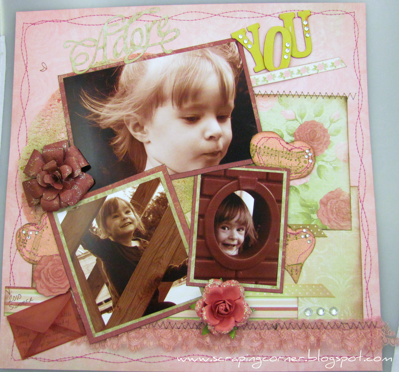
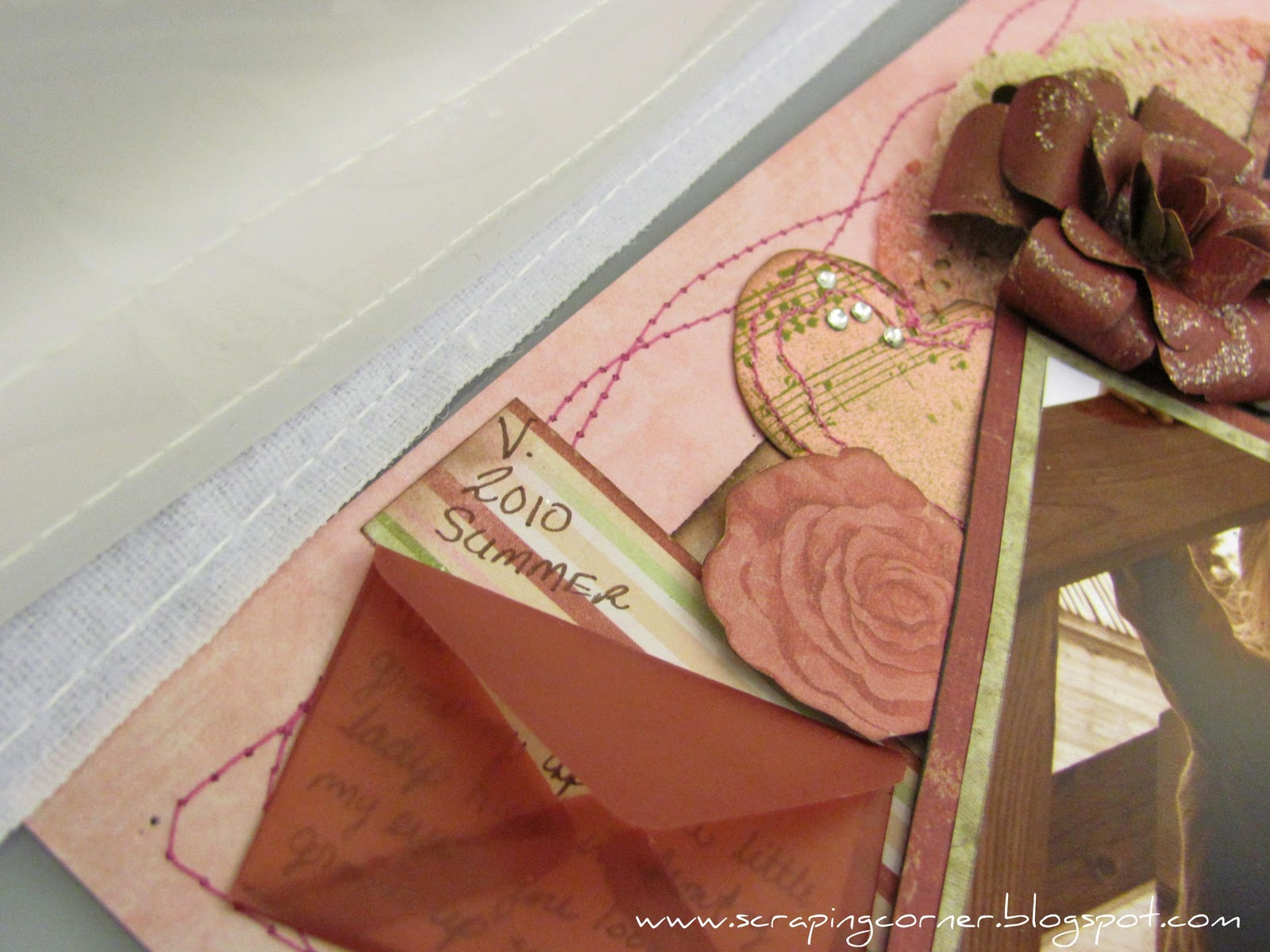
I must say, this 3 photo layout was alot easier to do, since I knew I wanted to do a layout of my son's first haircut ... boy did he need it, what a shaggy mop top he had going on before that hair cut. This weekend he is going to have his 3rd haircut. Time really flies, soon I won't be measuring time by the number of haircuts my kids have had, but the number of baby teeth that have fallen out, then by the number of A's they got on their report card, followed by the number of sleepless nights I've had worrying about them being out too late ... and life goes on like that.
Supplies:
Patterned Paper = My Minds Eye (background), Bo Bunny (brown), Basic Grey (orange), Graphic 45 (blue)
Embelishments = Prima (flowers), Petaloo (crochet flowers) stick pins (I believe they are Little Yellow Bicycle)
Journaling = Journaling card by MME, rubons Karen Foster
Other: Ranger Distress Ink, twine, Glimmer Mist, brads (Basic Grey, Stampin Up, dollar store)
Wednesday, March 9, 2011
Bo Bunny - Olivia Collection - Layout #2
Another layout using the Bo-Bunny Olivia collection; This one I didn't title (titles are so over rated sometimes aren't they?) These photos are taken the same night as my other layout, again they are my sister and this time with my daughter.
I used the Bo Bunny Wraps again, and since I didn't know what to do with the 'leather' trim that they have in the collection, I did a gather stitch on the sewing machine and hoped that it doesn't look too out of place. I tried two new techniques on some flowers; the flower on the bottom left I'm calling a "water flower" and it is 7 circles punched, then you dampen with a mini-mister of water and make a pleat into the bottom. I inked with distress ink while still wet, then allowed it to dry. I then hot glued the petals to the 7th circle overlapping he petals for a dimensional look. I used another of the Kaisercraft wood laser cut flowers, and agian glimmer misted it. The third flower (coral) was made by using a edge punch and then pleating the paper, again hot glue to hold down the centre and added another circle to the middle for the centre. I used a new background stamp that I got from Stampin Up just to try it out (wood grain) and I will definitely use that again, I love how it turned out|!| Some chip stickers and Basic Grey buttons and away you go!
If you want to see either of these Bo Bunny Olivia layouts in person, head on over to Auntie Em's Scrapboooking!
Thursday, February 3, 2011
Echo Park - Little Boy collection - layout "Siblings"
Another layout for Auntie Em's Scrapbooking and Beading.
Again using the Echo Park - Little Boy collection. I combined some Bo Bunny Double Dot as well. The background is Basic Grey - The Basics - I love that paper for backgrounds! I simply did a basket weave of several pieces of the patterned papers. I Glimmer Misted the corner of the page. I tried something new, cork! I'd never worked with cork before, but when I had been rummaging around in my Mother's basement last time I was home, I came across a stash of several sheets of cork in varying thicknesses that my Father had acquired probably 30 years ago! My title took me the longest to do on this, I first cut the letters out of both paper and chipboard. I stamped a floral image onto the paper letters in a Stampin' Up ink - Cherry Cobbler. Then I ran the paper letters through my Big Shot with the Swiss Dots Cuttlebug embossing folder. Then I distressed the letters in Antique Photo ink by T!m Holtz which brought the swiss dots to life!
The journaling is a poem that I came across; untitled and anonymous, so I can't take credit for this piece of creativity; it reads:
"Two little eyes, discovering what's new, two little hands, touching everything in view, a sweet little voice, asking you why, a mischievous smile, a whimpering cry, two little feet, jumping on the floor, a toddler's mission is to explore."I hope you enjoyed this layout! Of course this one too can be viewed in person at Auntie Em's Scrapbooking in Cornwall.
Monday, January 17, 2011
Seasonal Kit from Tina's Scrapbooking Creations - Winter layouts (3)
Well, Tina stumped me again with her various patterned papers in her Seasonal Kit, a grand mix of Echo Park, Little Yellow Bicycle, Bo Bunny, Creative Imaginations and some little trinkets.
Well, here is what I have come up with so far, three layouts, and started my fourth.
The first I will call Yuletide Carols;
Using the Little Yellow Bicycle paper as a title for this one, I used my clear embossing technique with a roller stamp that I have from Stampin' Up for the music notes on the background. I stitched around the outside edge (told you would see more stitching from me!) I covered a chipboard tag from the kit and used the ribbon from the kit to complete it. The journaling reads
OK, Tina is going to kill me over this one, but I absolutely hated the Little Yellow Bicycle paper that she put in there, it is full of Christmas sayings, some of it in metallic red foil print ... so what did I do with that paper? Aside from the odd little word here or there that I cut out and used for titles etc. I flipped it over and used the white backside and glimmer misted it! I cut out some of the ornaments from the Creative Imaginations paper and the trees from the same line, and used pop-dots to give it some dimension. This is my absolute favorite photo this Christmas, and it wasn't even taken by myself, it was taken by my sister. We must have taken 100 photos that day, and this was the best we got! I used Glossy Accents on the title to make it pop. No stitching on this one, but I did dashed lines to look like stitching. The journaling reads
Well, here is what I have come up with so far, three layouts, and started my fourth.
The first I will call Yuletide Carols;
Using the Little Yellow Bicycle paper as a title for this one, I used my clear embossing technique with a roller stamp that I have from Stampin' Up for the music notes on the background. I stitched around the outside edge (told you would see more stitching from me!) I covered a chipboard tag from the kit and used the ribbon from the kit to complete it. The journaling reads
"With their eyes all a glow... You guys enjoyed that electronic piano that Daddy got you for Christmas SO MUCH! Hours of fun tickling the ivory! Nigel & Vanessa Dec. 27th 2010"
The second I am calling Waiting...
OK, Tina is going to kill me over this one, but I absolutely hated the Little Yellow Bicycle paper that she put in there, it is full of Christmas sayings, some of it in metallic red foil print ... so what did I do with that paper? Aside from the odd little word here or there that I cut out and used for titles etc. I flipped it over and used the white backside and glimmer misted it! I cut out some of the ornaments from the Creative Imaginations paper and the trees from the same line, and used pop-dots to give it some dimension. This is my absolute favorite photo this Christmas, and it wasn't even taken by myself, it was taken by my sister. We must have taken 100 photos that day, and this was the best we got! I used Glossy Accents on the title to make it pop. No stitching on this one, but I did dashed lines to look like stitching. The journaling reads
"Patiently waiting for Santa Vanessa 2010"
The third I am calling Frosty The SnowDUDE; it is based on a sketch by one of Tina's designers Jill Sarginson. You know me and circles, I love them!! I kept this layout pretty tone on tone with the blues and browns from the kit. More stitching around the border. I tried to give this layout some dimension by making the snowflakes in layers. I glimmer misted the backside of the LYB paper again for the inside of the snowflakes. I put my Big Shot to use with a snowflake embossing folder in the smaller blue circle. I used Glossy Accents again on my title to make it stand out. The journaling reads
"Daddy helped Vanessa build a SNOW DUDE! Complete with a MOHAWK!! December 2010"
Wednesday, January 5, 2011
I Adore You - layout
I was at my local Scrapbooking Store when I saw the new line from Ksiser Craft - English Rose Collection ... WOW the colours are so fantastic just begging for a shabby chic spin on them! Dusty rose, faded burgundy, mossy green and ivory ... simply beautiful. So I purchased a 9 window frame with it and one of each of the pages from their collection. I started on the frame and will post that project in a later blog post.
I thought I would work with a sketch from Let's Scrap and see what I could do with the Kaiser Craft papers. Here is the sketch ...
I also wanted to try out my new sewing machine and there was a great deal of stitching on this sketch. Sew... I stitched and stitched some more. I'll have you know though, if you glue something down and then try to sew it (i.e. the lace on my layout) it really gums up your needle and jams up the thread ... so just a word of warning, if you intend on sewing, don't put too much glue down first, keep it minimal.
I made a couple of rough hearts and stitched around the outside of them, and used my new Stampin' Up wheel with Music Notes stamp (loving that right now) I thought I would try my hand at hidden journaling. I had some little velum envelopes from EK Sucess (had them for about 5 years actually) the hidden journaling reads:
"Vanessa; you are growing up into a little lady right in front of my eyes; you look so grown up sometimes!!"
I used the Home Decor Cricut cartridge for the word "adore". I used a prima Tea Rose - in Santa Rosa (this is one of the ones that I won a few months back) it worked perfectly (it is the little one on the bottom; I handmade the larger one on the left at the top). I also glimmer misted a paper doily using Olive Vine and Viva Pink and misted some of the hearts and ribbons with the same. I used my I-Rock for the first time on this ... not sure if I'm liking it or not (I know, Mandy, you love yours) but I am having a hard time getting the jems into the positions that I want, and keeping them there until I weld them down. Any tips??
Let me know what you think of the layout, does it look anything like the sketch?
Labels:
burgundy,
cricut,
i-rock,
Kaisercraft,
prima,
rose,
stampin up,
stitching
Subscribe to:
Posts (Atom)