side bars

Showing posts with label Bo Bunny. Show all posts

Monday, October 13, 2014

Siblings too far away - featuring Indian Summer

We had professional photos done last year when the kids half-brother came to visit from Germany.  I haven't yet scrapbooked them.... until today! This was the first time that I've been scrapbooking since summer, I've been spending so much time outside on my deck enjoying the summer I haven't wanted to be down stairs when it was so nice outside.  Well Fall is in full swing now, and this is the result!

I loves the colours in the Indian Summer collection from We R Memory Keepers, combined with a page from Lemonade Stand from Bo Bunny (Block Party) its a herringbone wood grain sheet that I used on the background of the second page.  I also used Prima flowers and alphas, gems from Queen & Co. and an overlay from Jillibean Soup

The kids miss their brother, and only get to see him once a year, and on Skype.


Let me know what you think!

Saturday, September 14, 2013

Surprize! Look at your Cake Face ...

A photo of my son on his first birthday - hard to believe he will be turning FOUR in just a couple of weeks ... already in school full time.  Where does the time go?

CAKE FACE

Using the Surprize collection from Bo Bunny I wanted the letter to pop a little so I used my fine tip Sharpie to doodle around the word surprize.  I used red ink to distress the edges to bring out the red of the paper line, and dripped some Heidi Swapp color shine in Sweet Cherry. A toilet paper roll and gesso for the random rings.  The balloons I used Utee and Versamark on to make them more dimensional. The title is Basic Grey chipboard letters.


Thanks for looking!


Monday, December 10, 2012

An Elf On A Shelf - mixed media style

So, I have been watching the She-Art trend take over the scrapbooking and mixed media world for about a year now.  I have to say, I do like Christy Tomlinson's style, but I wasn't sure if I 'got' the She-Art movement.  What does that have to do with An Elf On A Shelf you ask?? Well that's another really *hot* thing going on right now - this little elf that you purchase to keep an eye on your kids and report back to Santa.  I'll be the first to admit, they are a little creepy looking.  So, I decided I wanted to try my hand at the She-Art and in doing so I decided to do it Elf On A Shelf style.  So, here is my first attempt - not exactly what I was thinking, it's not a great likeness of "Lucy" our elf, but hey I had fun with the process, and I will do it again.


Ingredients:

Patterned paper - Pink Paislee (Mistletoe & Co. - Postcards); Teresa Collins - (Noel - Tags & Borders), Graphic 45 (Fashionista - Vintage Cherries), Carta Bella (Winter Fun - Snow Crystals), Bo Bunny - (Wholigins - Whoo-ligans), Stampin Up (Newprint designer series)
Stencil - Prima Marketing
Stamps - Christy Tomlinson (tattered chicken wire), Stampendous (Merry Snowman)
Misc. - gesso, texture paste, black doodle pen, ribbon, distress ink, chalk ink


Be kind, follow my blog and leave a comment.

Monday, October 22, 2012

Breast Cancer + Bo Bunny = Pink Purse giveaway!

As some of you know Breast Cancer touched my family 22 years ago, and cancer has reared it's ugly little head again.  October is Breast Cancer awareness month and Bo Bunny is promoting this with a beautiful pink purse!  What scrapping lady wouldn't love a pink purse?

I invite each of you to become a follower of the Bo Bunny Facebook page - LINK FOUND HERE, and tell them that Lorena sent you!

 
Yeah, will you look at that?? Isn't it beautiful??  I sure think so!!


Thursday, October 18, 2012

Little Miss - by Bo Bunny - 3 layouts

As soon as I saw this collection from Bo Bunny I knew I wanted the whole thing.  Last time that happened was with the Et Cetera line.  I adore this line, the muted soft colours of moss green and coral with undertones of brown.  So girly, and flirty. 

I've made 3 layouts so far and have plans for many many more, I could do an whole album with this collection!


See the hand-made flower on the photo there - I wanted to add dimension to the photo - I loved this photo but it needed something.

Texture paste to give some height.


This layout was a challenge to use up 'spare letters'

As yet untitled - may call it "on the Hill" as she is sitting in front of Parliament Hill.


Friday, March 16, 2012

Sharing some Magnolia cards

It's no secret that I love the Magnolia stamps - especially the Tilda's.   I am really hoping that one of my local retailers will start bringing them in soon.  As much as I love a good deal buying on Kijiji or Ebay - but I want to keep my local Scrapbooking Stores in business. On that note - here is a few samples that I picked up recently - however they are not new.


I've started to change my style of doing cards, let me know what you think?  All images have been coloured with my copic markers.

Saturday, February 4, 2012

A little Sweet Tooth in your life?

Here is my take on the Scrapbook and Cards Today/Page Maps calendar for the month of February using Bo Bunny's Sweet Tooth collection.

The photo is my daughter this summer at the beach.  The colours were perfect for this collection.  I also used some Ranger Crackle paint and stickles to mimic the sand. 

Let me know what you think!


Thursday, November 17, 2011

Two new Copic techniques

I was inspired to make a Vintage card by a very creative talent; Lacey Stephens - see her blog HERE.  I used her tip of stamping the image in brown ink instead of black.  It made a world of difference.  I would love to have made my card with the new Bo Bunny "Snowfall" collection, but I haven't got my hands on it yet... so I settled for their 2008 collection "Winter Whisper"   I'll tell you something, Bo Bunny has come a L-O-N-G way in three years ... from single sided very thin paper, to double sided cardstock and all the 'fixins'!  I love the brown and blue together, so it worked well to give the vintage feel I was going for on this card/image. 

I stamped a Magnolia image, Fairy Dust Tilda, and coloured her in all blues and browns.  I double mounted it with Spellbinders and a bit of Webster's Pages trim.  I used a Bo Bunny trinket which was originally a dark tarnished copper colour, and heat embossed it white.  A little bit of glitter and twine and finished.

My second card encompasses a totally different technique, it is called "no lines" colouring.  How you achieve this is by stamping the image in a very pale colour, usually blue.  However I don't have any light blue ink, but I do have a Stampin' Up ink called Pink Pirouette.  It worked very well for my needs.  Everything I was reading online suggested that this technique is very difficult.  I didn't find it as difficult as I feared ... but I will say that this first image is NOT my best work, and practice will make perfect (or at the very least, better)  I decorated this card with some various Prima flowers and a pebble.  Some very old paper from my stash, from one of those large packages the your non-scrapbooker friends give to you for Christmas thinking that this is an awesome gift because it is 100 sheets of scrapbook paper.  What they don't know is that you will be using the backs of the same paper for white backgrounds as the fronts of the paper are such a Dog's Breakfast of colours and shapes that you will never use more than 3 or 4 sheets.  Well I think this was sheet 5 out of that package.


Let me know what you think of these techniques, please leave a comment; they are free, just like smiles at McDonalds!

~Lorena~

Sunday, November 6, 2011

Thursday night Copic evening!

My friend Michelle and I got together this past Thursday and we did some stamping and Copic colouring.  It was a great time, filled with hot cocoa and laughs.
I love Michelle's choice in stamps too, she always finds interesting characters to buy.  Me I buy the same thing over and over "cutesie" charachters and it just seems I'm in a rut.  I love the idea of a stamp share though, where you bring your ink and paper and stamp images from others in exchange for stamps from your collection to them.  Check out Michelle's blog HERE

So, I only ended up colouring up two images and putting them to a card. 

For my first card "Ho ho ho" I thought the girl looked a little ... how shall I put this .... underdressed for Christmas?!  Anyway, hence the sentiment was born :o/  I paired it with the 2010 Christmas line from Basic Grey - Jovial (still one of my ultimate favorites)

My second card is more of a winter sceen, and I used the 2010 Bo Bunny Winter Collection - Winter Joy (again one of my favorites) I added a couple of Prima flowers and a rub-on from Cosmo Cricut ontop of a snowflake that I had embossed onto vellum (it was a leftover from a previous project)
I have some other projects in the works, keep your eyes on this blog for something crafty in the BEAD department!

Enjoy!

Lorena

Tuesday, November 1, 2011

November Page Maps Reviel

Here is my take on the Page Maps sketch for November for Auntie Em's Scrapbooking and Beading in Cornwall.  Emma gave us the totally amazing, fantastically desirable Et Cetera line to play with!  I was a pig in poop with this!  I love this line and was stoked to be working with it.  Also you will notice some Prima floral rosebud trim and Bo Bunny buttons from the Welcome Home collection - proof that you really can mix and match!  Be sure to check out Auntie Em's Scrapbooking blog HERE for more inspiration and an inspirational sale going on for the month of November at the store!


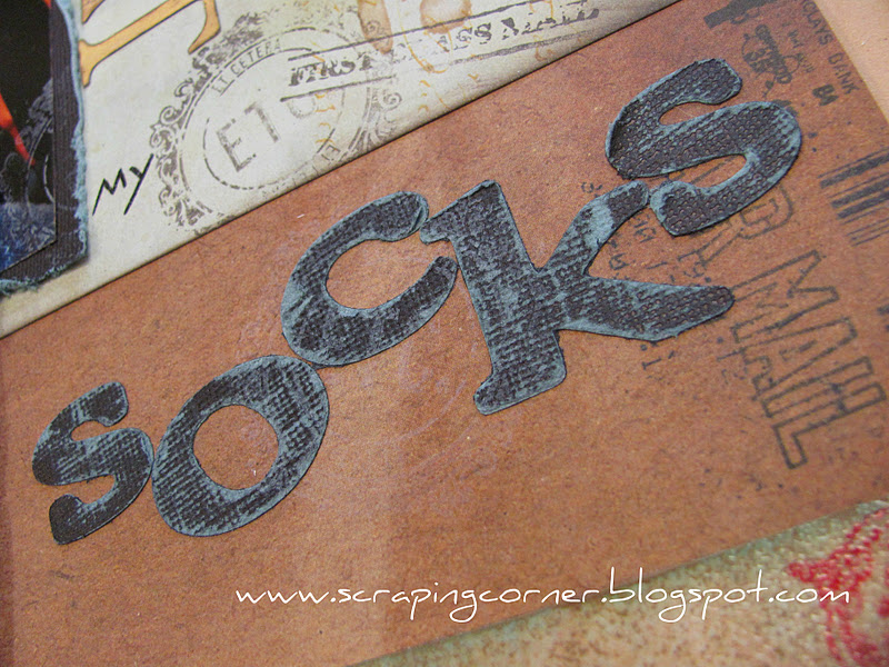
So Hungry I Could Eat My Socks


3 Cards:


Supply List:

Bo Bunny - Et Cetera collection: patterned paper, wraps, trinkets
Bo Bunny - Welcome Home collection: buttons
Prima: Floral Rosette Trim
Basic Grey: brads
Core'dinations: cardstock (love that stuff)

Sunday, October 16, 2011

Bo Bunny Card Sketch Challenge

Three cards to share using the Bo Bunny Forever Fall Collection.  I'm really liking the colours in this, especially the teal blue with all the rusts and browns and oranges!  What a great colour combo!


The Happy Anniversary card used the stamp collection too!

Saturday, September 17, 2011

"Building a Birdy House" Birdhouse kit from Ezee Pzee

OK, my disclaimer first - I have a two year old and a three year old, and they are in *love* with Mickey Mouse Clubhouse - and I'm in *love* with the way Goofy sings "I'm building a birdy houusssee" with his warbley voice ... forgive me, it really is funny in my house :o)

Anyway ... I picked up a birdhouse kit from Ezee Pzee, and I believe the only retailer in Ontario currently for Ezee Pzee is still Loonie4Scrapbooking. I Loved this little birdhouse kit from the moment I saw it in, I believe it was Canadian Scrapbooker - Spring 2011issue

I used the Bo Bunny Gabrielle collection, papers and trim,  and an assortment of Prima flowers.  The little bird came with the kit too, I added some Paper Clay to him to give him some dimension; thanks for the tip on that Louise Williams.  I coloured the bird with my Copics and added a bling for his eye.

Let me know what you think!


Monday, September 5, 2011

Prize winning entries into Newington Fair

I entered a few layouts and cards into our County Fair, five entries to be exact - and every entry placed!  This was the first year I've exhibited in the fair.  I think this was a good debut if I do say so myself. 

The first category was "Enjoying the 2010 county fair" so I did a photo of my daughter standing next to the sign that dictates if you are tall enough to ride on the ride.  She is a shorty, and well, she never did get to go on any rides that year.  I took the idea for the title from a Beatles tune "Ticket To Ride"

Journaling reads:
You are not quite tall enough to ride the rides yet at the Newington Fair.  Maybe next year you will get your "Ticket To Ride"  Vanessa Sept 2010
Supplies:
Patterned Paper: Basic Grey (Cappella), Echo Park (Sweet Summertime - yellow polka dot), Little Yellow Bicycle (measuring tape), Echo Park (Walk In The Park - letters), Bazzil Basics - cardstock
Embelishments: Girls Paperie (brads), Basic Grey - Opaline (bling), Prima (rub-on & flowers) Dollar Store (flowers and doily), seam binding ribbon, October Afternoon (twine)
Machine stiching and typewriter.


The Second layout I'm calling School Days. The category for this exhibit was photos earlier than 1960. This is a photo of my late father, taken around 1956.  


Journaling reads:

Dad, I know you weren't very scholarly. But you were one of the wisest men I have ever known.  You use to know the answer to every question we asked as kids, and when you didn't know the answer you would make something so farfetched up that we had no choice but to laugh!  I miss your wisecracks, your smart ass remarks and your tough lessons that you taught me.  Life isn't the same without you here.  Frederick Paul Rice Sept 19 1948 - Nov 23 2008, photo taken 1956


Supplies:
Patterned Paper: background paper - unknown, Bazzil Basics - cardstock, Bo Bunny - Timepiece collection (subtitles and watches)
Embellishments: 7Gypsies - key, Ranger -Ultra Thick embossing powder, twine
Other: Cricut, and old typewriter font for journaling

The other layouts you should recognize from previous posts Avonmore Berry Farm, and Baby's First Halloween. I've added links to the previous posts so you can see close up's of those two layouts.
 

Total Pageviews

LinkWithin

Related Posts with Thumbnails