side bars

Showing posts with label glimmer mist. Show all posts

Thursday, September 1, 2011

Page Maps September - Auntie Em's

Wow, is September really here? Summer is starting to fade away, I've noticed the outer leaves on trees turning their autumn hues already.


But what September does bring with it, is the Copic registration class. I will be attending the first Copic course on September 18th. This will allow me to teach Copic techniques. I'm very much looking forward to this opportunity. I've had so much fun with the Copic Markers, and find myself adventuring out of my box too, blending colours, adding more texture and the like.

So, without further adieu, September also brings another PageMaps reveal. Mellisa and I received some Bo Bunny new Double Dot, and some more of Emma's favourite Stella & Rose from My Minds Eye. She also provided some flower pins and crocheted flowers.

I must say, this 3 photo layout was alot easier to do, since I knew I wanted to do a layout of my son's first haircut ... boy did he need it, what a shaggy mop top he had going on before that hair cut. This weekend he is going to have his 3rd haircut. Time really flies, soon I won't be measuring time by the number of haircuts my kids have had, but the number of baby teeth that have fallen out, then by the number of A's they got on their report card, followed by the number of sleepless nights I've had worrying about them being out too late ... and life goes on like that.
Supplies:


Patterned Paper = My Minds Eye (background), Bo Bunny (brown), Basic Grey (orange), Graphic 45 (blue)
Embelishments = Prima (flowers), Petaloo (crochet flowers) stick pins (I believe they are Little Yellow Bicycle)
Journaling = Journaling card by MME, rubons Karen Foster
Other: Ranger Distress Ink, twine, Glimmer Mist, brads (Basic Grey, Stampin Up, dollar store)

Saturday, July 30, 2011

Pink Paislee - Butterfly Garden

Two layouts to share using the A-MA-ZING Butterfly Garden collection.  What a fantastic line, full of soft peaches, light blues and distressed browns.  Just begging for a shabby chic!

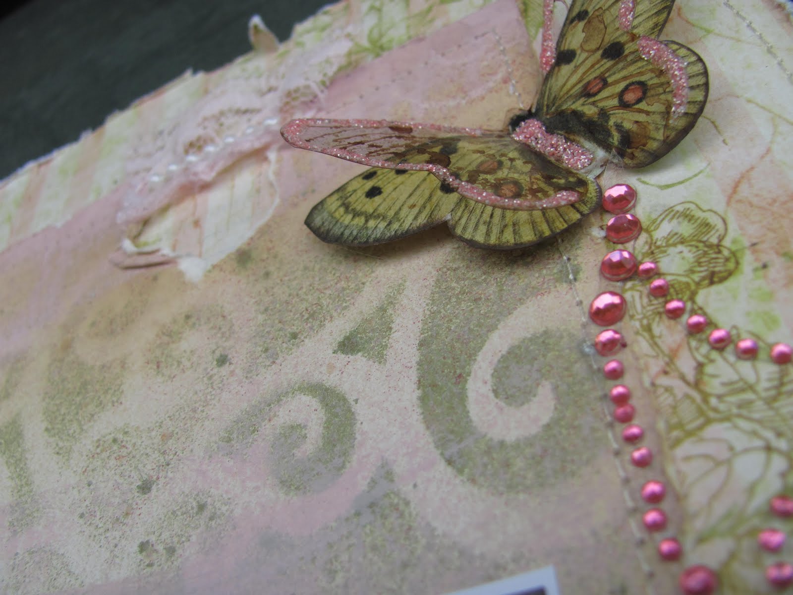
The first layout isn't really titled, but I will call it "Imagine" as that's the Tim Holtz trinket tag I used on it - I haven't thought of anything suitable, and therefore it contains no journaling either.  I did some masking and Glimmer Mist stamping, and small beige flower at the right if the ribbons and trim is one of my own creation.  You may have seen it in an earlier posting.


The second layout I've called "Tackle" and the journaling reads


"You two have so much fun tackling each other on the floor. But for some reason its always Nigel who comes out of it with a bruise"


I used a few different materials on this piece, I braided some raw canvas, and did the letters in chipboard covered in dictionary text.  I also used a piece of material that you use to hem with - it is called fusible web - it was really neat to work with, as it will stick to whatever you have it touching when you apply heat - which I did with my heat gun.  One of my Cabbage Roses, this time made out of a page from a hymn book and sprayed with Glimmer Mist.  I also used some Staz On ink on acetate to make some 3D butterflies.

Happy crafting everyone! 

Enjoy!

Wednesday, March 9, 2011

Bo Bunny - Olivia Collection - Layout #2

Another layout using the Bo-Bunny Olivia collection;  This one I didn't title (titles are so over rated sometimes aren't they?)  These photos are taken the same night as my other layout, again they are my sister and this time with my daughter.

I used the Bo Bunny Wraps again, and since I didn't know what to do with the 'leather' trim that they have in the collection, I did a gather stitch on the sewing machine and hoped that it doesn't look too out of place.  I tried two new techniques on some flowers; the flower on the bottom left I'm calling a "water flower" and it is 7 circles punched, then you dampen with a mini-mister of water and make a pleat into the bottom.  I inked with distress ink while still wet, then allowed it to dry.  I then hot glued the petals to the 7th circle overlapping he petals for a dimensional look. I used another of the Kaisercraft wood laser cut flowers, and agian glimmer misted it.  The third flower (coral) was made by using a edge punch and then pleating the paper, again hot glue to hold down the centre and added another circle to the middle for the centre.  I used a new background stamp that I got from Stampin Up just to try it out (wood grain) and I will definitely use that again, I love how it turned out|!|  Some chip stickers and Basic Grey buttons and away you go!


If you want to see either of these Bo Bunny Olivia layouts in person, head on over to Auntie Em's Scrapboooking!

Monday, March 7, 2011

Bo Bunny - Oliva collection

I'm really loving the colours in the Olivia Collection by Bo Bunny.  I've always liked coral and teal together.  Mix in some rusty brown and I'm even happier!  The photo in this layout is of my sister and my son.  I chose to focus in on their eyes.  Both of them have brown eyes - and such a deep brown too.  My husband nor I have brown eyes, but Nigel got his brown eyes from my Father's side of the family - as did my sister.  What a great shot of the two of them!

I used Bo Bunny's Wraps trim in the top, and chipboards. The wooden flower is Kaiser Craft that I glimmer misted.  The letters are Basic Grey. I used my I-rock on the flowers and in the bottom right corner.  The journaling a printed on my computer with Vintage Typewriter font, and I distressed with Vintage Photo ink and Wheatfields gimmer mist.  The button is Bo- Bunny as well, it came on the trim!

The journaling reads:
"Daddy's eyes are hazel, Mommy's eyes are blue, Your eyes are deep brown, Where do you get those eyes?  Ah, Auntie's eyes are the same colour!"


Believe it or not ... the date at the bottom is NOT written in PINK - for some reason the white Signo ink turned pink on this page after I wrote it ... I'll have to remember that if I ever actually do want pink ink!!


Friday, March 4, 2011

Staying Creative

Here are a few cards and a layout that I've been working on recently.

The story behind the layout it that I don't know a THING about Harry Potter - not a dang thing, and when I started working with this lovely collection of Harry Potter papers and embellishments, I had no clue what to do with it.  Don't get me wrong, the paper is lovely - all antique like and my colours too.  The only thing I know that is associated with Harry Potter is the word "Muggles".  You see my husband and I Geocache - that is, we use a GPS to plug in latitude and longitude co-ordinates and play a game of "hide and seek" looking for a 'cache' that is filled with trade able trinkets and a log book.  It is a great outdoor adventure that takes you to places that you likely wouldn't have traveled to if not for hunting for 'tuperware in the woods'.  That being said; a Muggle is a person who is not a Geocacher who happens to stumble upon either the cache or you scouring the woods.  There you go ... there's the link!

Watch Out for Muggles

So, I used three different papers from the collection for this, and printed my story out on ivory cardstock with the font Kristen using my computer. Then distressed the paper and inked with Tim Holtz Distress Ink in Vintage Photo, and used two Glimmer mists; Coffee Shop and Wheatfields. I stitched the one paper with my sewing machine, and distressed the edges with Tim Holtz Distressing ink in Vintage Photo. I The title is Basic Grey Chip letters. The button is a vintage military button from my husband's sewing box. The ribbon trim I'm not sure about the brand.


The journaling reads:
"As soon as we introduced Geocaching to you, you were hooked.  The idea of hide and seek and treasure hunting all together  was terrific. Being outside in the woods looking for Tupperware was such a concept.  Watch out for Muggles - those are people who are not familiar with Geocaching - you don't want them to be aware of what you are doing; so they won't accidentally find the Cache"
.


The Cards
 
Using the Sew Easy tool from We R Memory Keepers I put together the following 3 cards.
 
For the first card I used an Asian themed background paper (unknown) and Chinese Lanterns stamp (Inkadoo) and kept it simple without a a sentiment. I used Tim Holtz Distress Ink in Vintage Photo, and Glimmer Mist in Wheatfields. Finished off with two butterfly stamps (Martha Stewart)


The second card I used a snowflake patterned paper (unknown) and two different Bo Bunny double dot cardstocks and some white Bazzil. I used the "Burst" wheel on this card and instead of rolling it in a row, I used the burst in the form of snowflakes. I cut a snowflake with the Cricut (Potpourri cartridge) out of vellum and some hemp string. I use the I-rock gem setting tool for the bling on the snowflake.


For the final card - Happy Birthday - I used October Afternoon's Thrift Shop collection patterned papers and red Bazzil cardstock. I used the Cricut to cut the Happy Birthday (Potpourri) and a piece of salvaged ribbon from a box of chocolates.


Saturday, February 12, 2011

Valentine's Day projects ...

OK, so if scrapbook paper sits in your stash for two years, does that make it Vintage?  I had allmost all of the entire collection of Basic Grey's Bittersweet still untouched.  I had done a layout or two and I think maybe a card or two as well.  But for the most part I hadn't used this collection for anything.  I promised my sister that I would help her make a Valentine card for her man on Sunday, so I thought I would pull out all the valentine papers and embellies that I tend to collect and rarely use.

That being said, I made two cards (six actually, as I made three of each design - I find it easier to make multiples of the same card when I am designing it) and a layout.

The layout I'm calling LOVE ROCK; and the photo is of some "shiny rocks" as my daughter calls them.  They were part of a centerpiece to a wedding I went to years ago (Julia & Rob).  I had put the rocks into my daughter's sand box and photographed them ... anyway, not a very exciting photo, but was a neat shot.

I tried a minimalist approach to this layout - my husband says it's missing something ... I dunno, I think it's done.

I glimmer misted an American Crafts rose ribbon - it started out white ... I love glimmer mist!  Of course more stitching on this one too!


Let me know what you think!

Thursday, February 3, 2011

Echo Park - Little Boy collection - layout "Siblings"

Another layout for Auntie Em's Scrapbooking and Beading

Again using the Echo Park - Little Boy collection.  I combined some Bo Bunny Double Dot as well.  The background is Basic Grey - The Basics - I love that paper for backgrounds!  I simply did a basket weave of several pieces of the patterned papers.  I Glimmer Misted the corner of the page.  I tried something new, cork!  I'd never worked with cork before, but when I had been rummaging around in my Mother's basement last time I was home, I came across a stash of several sheets of cork in varying thicknesses that my Father had acquired probably 30 years ago!  My title took me the longest to do on this, I first cut the letters out of both paper and chipboard.  I stamped a floral image onto the paper letters in a Stampin' Up ink - Cherry Cobbler.  Then I ran the paper letters through my Big Shot with the Swiss Dots Cuttlebug embossing folder.  Then I distressed the letters in Antique Photo ink by T!m Holtz which brought the swiss dots to life!

The journaling is a poem that I came across; untitled and anonymous, so I can't take credit for this piece of creativity; it reads:
"Two little eyes, discovering what's new, two little hands, touching everything in view, a sweet little voice, asking you why, a mischievous smile, a whimpering cry, two little feet, jumping on the floor, a toddler's mission is to explore."
I hope you enjoyed this layout!  Of course this one too can be viewed in person at Auntie Em's Scrapbooking in Cornwall.


Total Pageviews

LinkWithin

Related Posts with Thumbnails