side bars

Showing posts with label tim holtz. Show all posts

Friday, March 21, 2014

This Moment - Sister's - same last name no more ...

This is one of my favorite photos from my wedding - it was very impromptu and un-rehearsed, my sister put her elbows on my shoulders and folded her hands on my head.  It was an amazing moment captured.  This was the last day that we both shared the same last name.  Both of us are now married and have started families of our own.  Photographs are an amazing tool to capture a memory.  The background sheet is from the Ledger pad, and I used the new Stationer's Desk collection from Prima for this layout, and coloured up a Paintable ATC card with Distress Markers and Perfect Pearls (sorry about the glare).  I coloured some Scrap FX chipboard pieces with Twinkling H2O's (wow let me tell you that the pigment in those things is amazing!) and used Ranger's Rock Candy crackle on top.  I used various Prima stamps all over the background and a Tim Holtz stencil with heavy gesso, the finishing touch was Say It In Crystals from the same Stationer's Desk collection - I had my doubts that they matched as they looked too light - but they match perfectly!  The flowers are all Prima as well.


Let me know what you think of this layout - I love to hear your comments.  And just a heads up - I will be selecting a winner from one of my comments when my page views reaches 40Kwhich is very soon ... just sayin'!

Wednesday, August 14, 2013

Watercolouring with Distress Markers - techniques class - Aug 21st 2013

Create soft water colour images with Tim Holtz Distress Markers. Not just for
journaling, these markers are perfect for colouring a stamped image or using the
peel off sticker images to create a stained glass look. A less expensive alternative to Copic, you will fall in love.


You need not bring anything to the class, all supplies will be included - you will not come out with a finished product, this is a techniques class.  You will have many images to turn into fantastic cards, pre-cut card kits will be available for purchase.

Class will be taught
by Lorena August 21st, 6:00pm. $17 + HST. Call the store today to reserve your spot.


Space is limited - call Auntie Em's today to reserve your spot


Monday, March 25, 2013

More from the Mega Challenge - En Francais

Um yeah, I'm not writing this blog post En Francias - but it's all about the Prima paper line En Francais collection!  This is part three of my projects created with this line - and I'm still not out of paper or inspiration.  It truly is a versatile collection.

Lost A Mitten


I used some gesso to create white space then stamped over the gesso with the script stamp from this collection. Some Tim Holtz tickets in the corner, and a combination of Prima alphas and Thickers for the title.  Sepia photos are particularly perfect for this line.

 Mr. Serious
  
 
I used a Prima mask on this layout with modeling paste and Pan Pastals to give texture to the feather in the corner.  I used another mask and tinted gesso with gelatoes and then painted with gelatoes for the bricks.  You see that folk - more BOY layouts, LOL and flowers on every single one of them too *grinz*

Tuesday, December 4, 2012

Advent Calendar for years to come

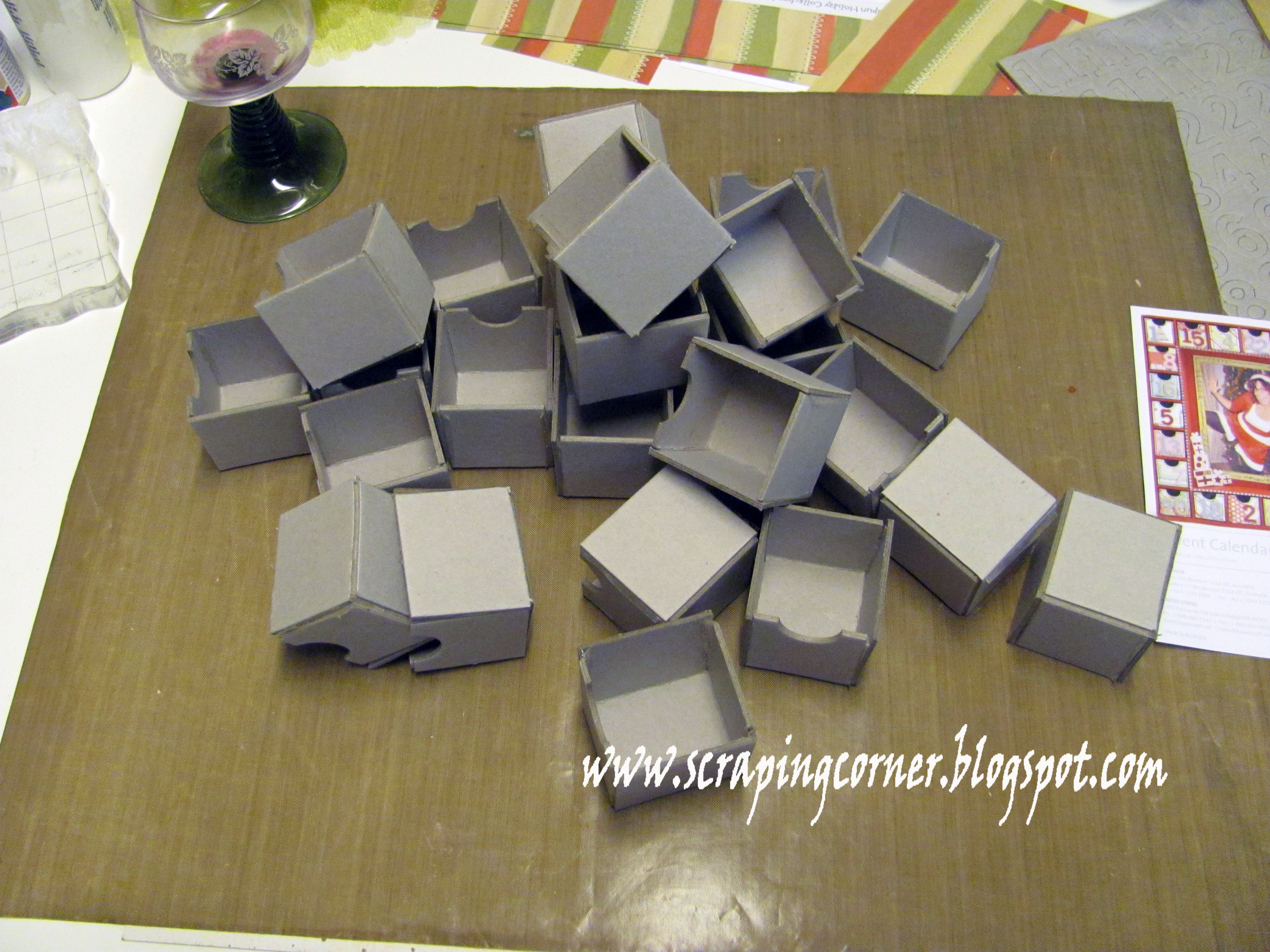
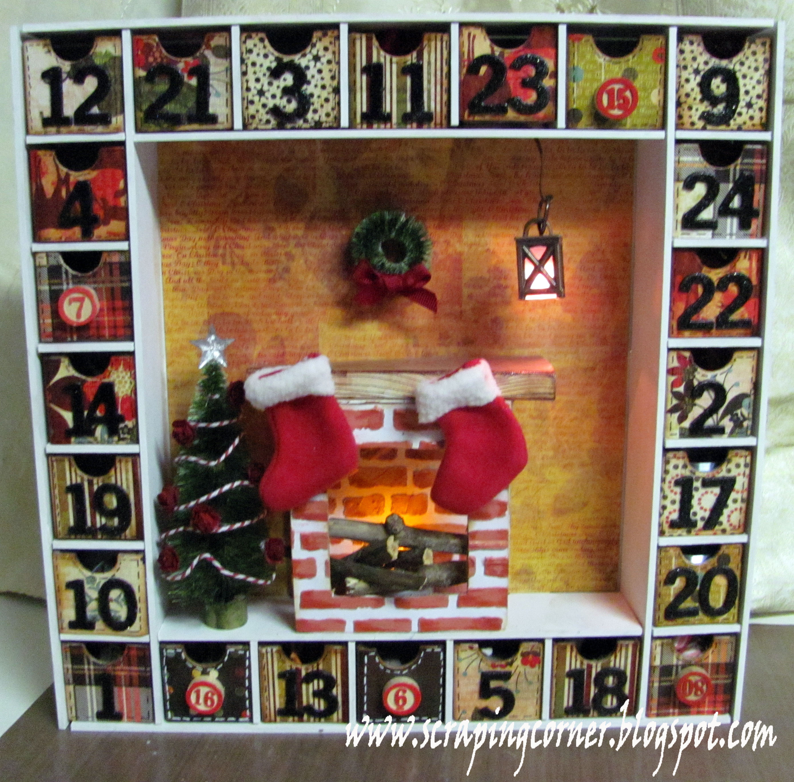
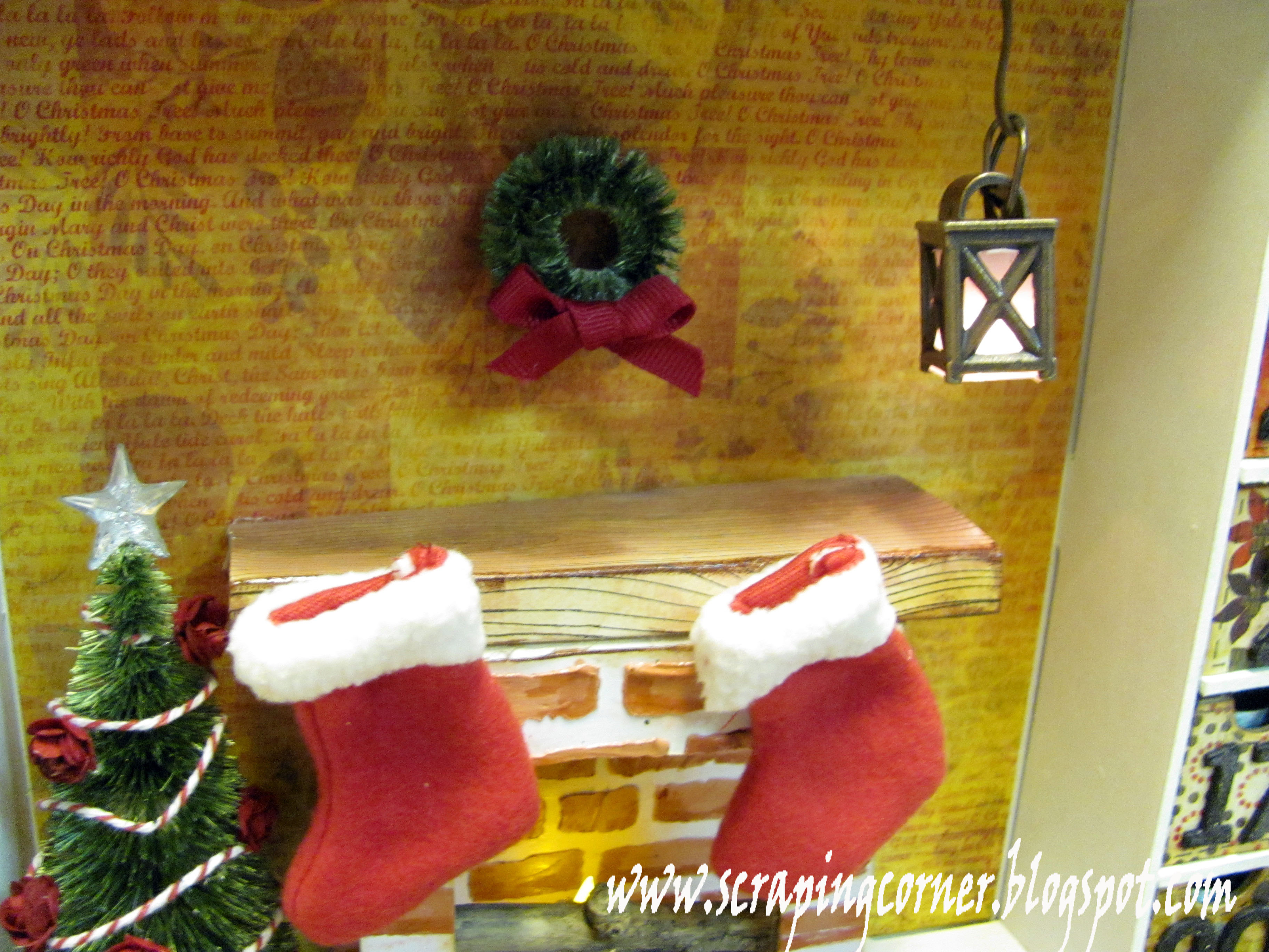
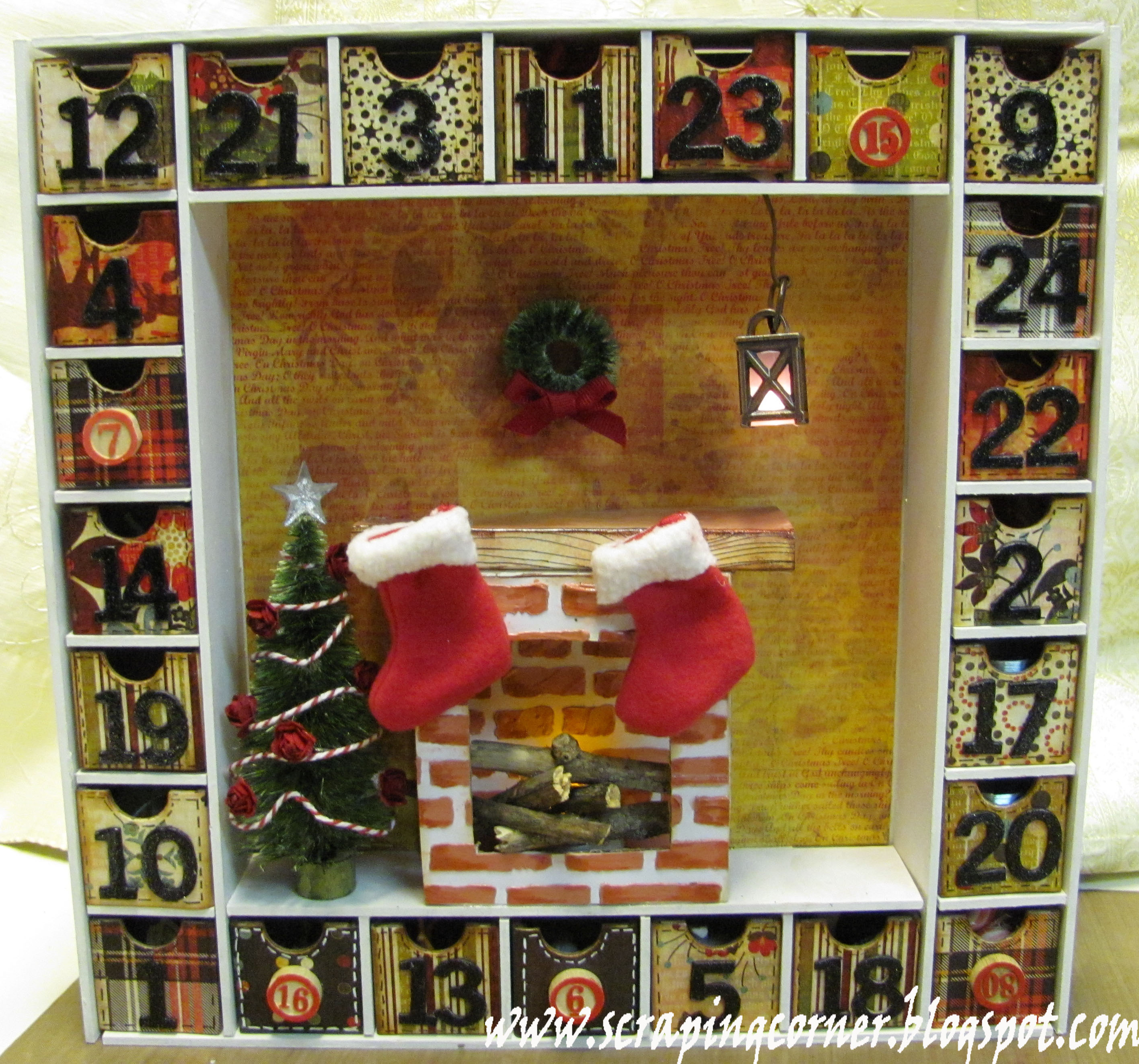
When Emma had her sale this summer I bought a Kaisercraft Advent calender with hopes of having it done by December 1st for the kids to celebrate the season with .... well I'm not horribly late - just tardy as per my predictable self!  I finished it today - December 3rd!
 
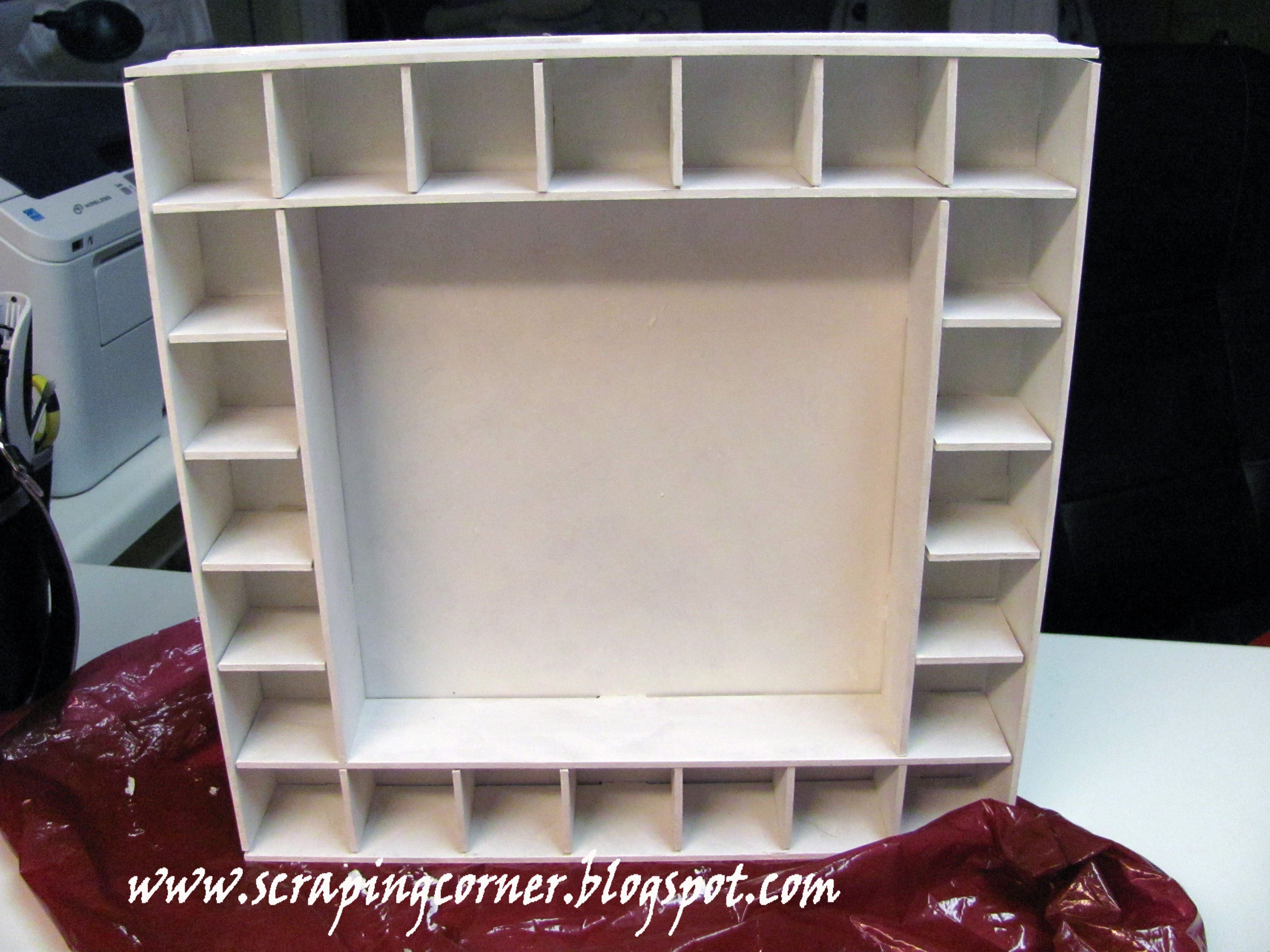
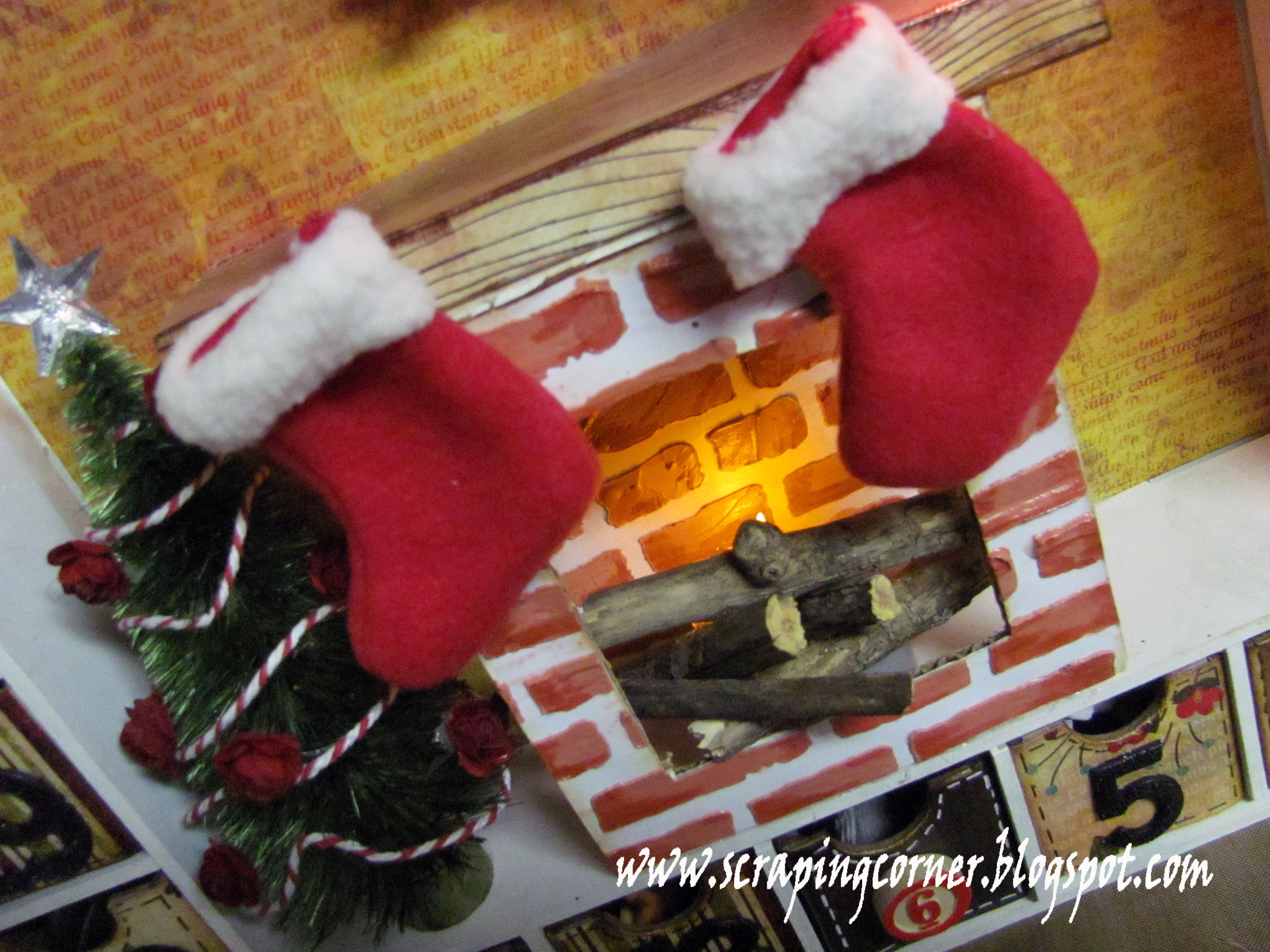
I wanted this calendar to be unique, and timeless.  First I painted all the parts to the box white.  And put the boxes together with Ranger Terrifically Tacky double sided tape.  I wanted to use my favorite Christmas paper line Jovial by Basic Grey.  I created a fireplace with texture paste and gelatoes using a Prima stencil.  I wanted some lighting in the shadow box of this calendar, so I used a flameless tealight and some sticks as logs in the fireplace.  I also used a Tim Holtz mini lantern and his Woodlands collection tree and wreath.  I coloured the tree and wreath with Glimmer Glaze in Dirty Martini.


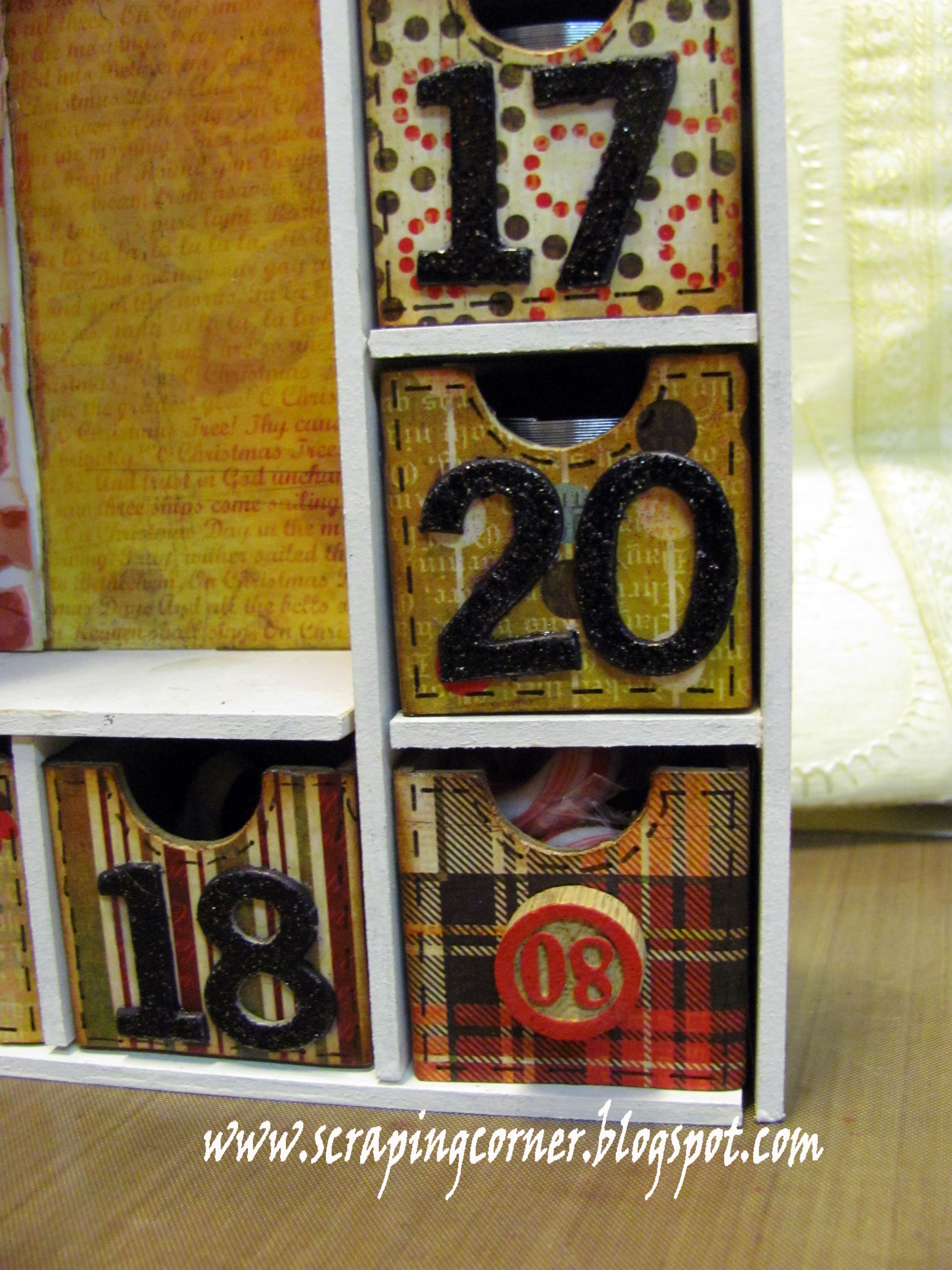
I kept the boxes simple and without too much decoration - so I inked them and put faux stitching on the edges.  I Mod Podged each of the boxes for durability for years to come.  Flowers on the tree are Prima, and the twine is Doodlebug.  The star on the tree is Teresa Collins.  The stockings are Debbie Travis garland!  I replaced some of the numbers with Tim Holtz bingo markers.


A trip to the dollar store to fill the boxes with trinkets, toys and the odd chocolate.  I can't wait to see the look on their faces for years to come when I haul this beauty out with the Christmas decorations!  I loved the process.  Although the building stage could have used more instructions ... and by more I mean ANY!  This kit came only with a photo of the finished product, nothing else. 
 
 
Let me know what you think - be kind become a subscriber and leave a comment.


Wednesday, September 5, 2012

Gift Card Holder - Tutorial

I love to create my own handmade gifts for my loved ones at Christmas time. However there are some you just don't know what to make for. That's when I give gift cards so that they can buy what they would like!
So, here is a beautiful gift card holder that I designed to look like a wallet.


I used my Big Shot to dry emboss a leather grain onto some white paper (8 1/2 x 4 1/2) so when it is folded it is almost square.


I then used two different colours of distress ink to give it a worn leather look.


I covered the whole paper with clear heat embossing powder and heated it to give a very shiny look to it.


I cut strips of paper of different heights for pockets to hold the gift cards.


I hand stitched the edges for a more authentic look.


Added a ribbon and 'hitch ball' closure.

Thursday, June 14, 2012

Its all Fun & Games .... until?

Page Maps - June featuring Echo Park - This & That
Wow, I loved this collection from Echo Park - This & That.  I'm not one to usually fawn over Echo Park, but they have really come a long way in the last two years from their infancy stages, very impressed I was with this collection.  I loved the colour collection of the browns, yellows and teal green.  I loved the boy theme to it, and all the wood grain!

So, this is me at Casino Rama in Orillia Ontario - my friend got tickets to see Sheryl Crow and we decided to 'make a donation' at the casino afterwards - great times!  The arms raised in the air was from a commercial that Casino Rama was re-running over and over - I guess you had to see it to understand.


The theme to this month was sewing - I've employed 3 different types of stitching - I used my machine to stitch down the middle, I hand sewed in a blanket stitch  the pocket and I did some faux stitching on the arrow and again across the middle.  I layered some Prima flowers and coloured the naked chipboard arrow with the new Spring Distress ink in Peacock Feather - love that colour!!  I had alot of story to tell with this layout, so I decided to tuck a journaling card into the pocket.

Leave me a comment about your favorite time at a Casino - did you win big?  Or just leave $60 richer like I did?

~Lorena~


Sunday, March 13, 2011

Circle Punch flower - tutorial

Here is a tutorial on a flower I have recently made - I've been calling it a "water flower" but it would more accurately be called a Circle Punch flower.  I was calling it water flower because you use a water mister to make the petals wet so they are malleable.

You will need:

- patterned paper or cardstock
- circle punch (I used 1 1/8")
- water mister
- distress ink
- stapler
- button for centre

Step OnePunch 7 circles.  Six will be the petals, one will be the base.


Step Two

Mist the 6 circles with water, then ink with distress ink on the edges.  Remember that Distress ink reacts to water, this gives a neat effect on the petals.


Step Three

Fold a pleat into each of the six moist circle petals and secure with a staple at the base of the pleat.

Step Four

Staple each of the petals onto the base circle.  Work in a clockwise fashion overlapping the previous petal.


Step Five


Create a centre to your flower.  You can use a large brad or I have used buttons with twine.


Voila, you now have a pretty little dimensional flower!

Let me know what you think - become a follower of the blog - I'm always posting nifty stuff :o)


Wednesday, March 9, 2011

Bo Bunny - Olivia Collection - Layout #2

Another layout using the Bo-Bunny Olivia collection;  This one I didn't title (titles are so over rated sometimes aren't they?)  These photos are taken the same night as my other layout, again they are my sister and this time with my daughter.

I used the Bo Bunny Wraps again, and since I didn't know what to do with the 'leather' trim that they have in the collection, I did a gather stitch on the sewing machine and hoped that it doesn't look too out of place.  I tried two new techniques on some flowers; the flower on the bottom left I'm calling a "water flower" and it is 7 circles punched, then you dampen with a mini-mister of water and make a pleat into the bottom.  I inked with distress ink while still wet, then allowed it to dry.  I then hot glued the petals to the 7th circle overlapping he petals for a dimensional look. I used another of the Kaisercraft wood laser cut flowers, and agian glimmer misted it.  The third flower (coral) was made by using a edge punch and then pleating the paper, again hot glue to hold down the centre and added another circle to the middle for the centre.  I used a new background stamp that I got from Stampin Up just to try it out (wood grain) and I will definitely use that again, I love how it turned out|!|  Some chip stickers and Basic Grey buttons and away you go!


If you want to see either of these Bo Bunny Olivia layouts in person, head on over to Auntie Em's Scrapboooking!

Friday, March 4, 2011

Staying Creative

Here are a few cards and a layout that I've been working on recently.

The story behind the layout it that I don't know a THING about Harry Potter - not a dang thing, and when I started working with this lovely collection of Harry Potter papers and embellishments, I had no clue what to do with it.  Don't get me wrong, the paper is lovely - all antique like and my colours too.  The only thing I know that is associated with Harry Potter is the word "Muggles".  You see my husband and I Geocache - that is, we use a GPS to plug in latitude and longitude co-ordinates and play a game of "hide and seek" looking for a 'cache' that is filled with trade able trinkets and a log book.  It is a great outdoor adventure that takes you to places that you likely wouldn't have traveled to if not for hunting for 'tuperware in the woods'.  That being said; a Muggle is a person who is not a Geocacher who happens to stumble upon either the cache or you scouring the woods.  There you go ... there's the link!

Watch Out for Muggles

So, I used three different papers from the collection for this, and printed my story out on ivory cardstock with the font Kristen using my computer. Then distressed the paper and inked with Tim Holtz Distress Ink in Vintage Photo, and used two Glimmer mists; Coffee Shop and Wheatfields. I stitched the one paper with my sewing machine, and distressed the edges with Tim Holtz Distressing ink in Vintage Photo. I The title is Basic Grey Chip letters. The button is a vintage military button from my husband's sewing box. The ribbon trim I'm not sure about the brand.


The journaling reads:
"As soon as we introduced Geocaching to you, you were hooked.  The idea of hide and seek and treasure hunting all together  was terrific. Being outside in the woods looking for Tupperware was such a concept.  Watch out for Muggles - those are people who are not familiar with Geocaching - you don't want them to be aware of what you are doing; so they won't accidentally find the Cache"
.


The Cards
 
Using the Sew Easy tool from We R Memory Keepers I put together the following 3 cards.
 
For the first card I used an Asian themed background paper (unknown) and Chinese Lanterns stamp (Inkadoo) and kept it simple without a a sentiment. I used Tim Holtz Distress Ink in Vintage Photo, and Glimmer Mist in Wheatfields. Finished off with two butterfly stamps (Martha Stewart)


The second card I used a snowflake patterned paper (unknown) and two different Bo Bunny double dot cardstocks and some white Bazzil. I used the "Burst" wheel on this card and instead of rolling it in a row, I used the burst in the form of snowflakes. I cut a snowflake with the Cricut (Potpourri cartridge) out of vellum and some hemp string. I use the I-rock gem setting tool for the bling on the snowflake.


For the final card - Happy Birthday - I used October Afternoon's Thrift Shop collection patterned papers and red Bazzil cardstock. I used the Cricut to cut the Happy Birthday (Potpourri) and a piece of salvaged ribbon from a box of chocolates.


Total Pageviews

LinkWithin

Related Posts with Thumbnails