side bars

Showing posts with label distress ink. Show all posts

Sunday, January 5, 2014

Art Venture Anaheim .... here I come!

This is a vacation I have been looking forward to for many months!  I signed up in May 2013 for Art Venture Anaheim, and it is just days away now!  Prima Marketing puts together a fantastic two day event full of Prima Instructors teaching phenomenal projects with NEW product and techniques.

To my excitement Prima Art Venture is coming to Canada in the spring (April 11-13 2014) and I will be going to that one too!  Here is the link for the details on Art Venture Canada.  All lodging and meals are included.

So, some of the girls are getting together to trade ATC's (Artist Trading Cards).  They are a 2.5" x 3.5" card that represents your creative style.  Well nothing says my style other than: Copic colouring, Pink, and Antique Linen distress ink!! Only thing I'm thinking I should have added somewhere on it is a daisy, oh well, next time. Well here is what I came up with - let me know what you think.


I'm also looking forward to going to CHA while in California! 
 

Monday, December 10, 2012

An Elf On A Shelf - mixed media style

So, I have been watching the She-Art trend take over the scrapbooking and mixed media world for about a year now.  I have to say, I do like Christy Tomlinson's style, but I wasn't sure if I 'got' the She-Art movement.  What does that have to do with An Elf On A Shelf you ask?? Well that's another really *hot* thing going on right now - this little elf that you purchase to keep an eye on your kids and report back to Santa.  I'll be the first to admit, they are a little creepy looking.  So, I decided I wanted to try my hand at the She-Art and in doing so I decided to do it Elf On A Shelf style.  So, here is my first attempt - not exactly what I was thinking, it's not a great likeness of "Lucy" our elf, but hey I had fun with the process, and I will do it again.


Ingredients:

Patterned paper - Pink Paislee (Mistletoe & Co. - Postcards); Teresa Collins - (Noel - Tags & Borders), Graphic 45 (Fashionista - Vintage Cherries), Carta Bella (Winter Fun - Snow Crystals), Bo Bunny - (Wholigins - Whoo-ligans), Stampin Up (Newprint designer series)
Stencil - Prima Marketing
Stamps - Christy Tomlinson (tattered chicken wire), Stampendous (Merry Snowman)
Misc. - gesso, texture paste, black doodle pen, ribbon, distress ink, chalk ink


Be kind, follow my blog and leave a comment.

Sunday, October 21, 2012

Seasonal art journaling

I can't believe it snowed on October 12th, good grief!  And if that wasn't bad enough ... my kids were EXCITED about it, they wanted it to stay!  Are you kidding me?!?  I would like to move to a place where the temperature is a consistent 24 degrees.  So I did an art journal page about my experience  that day ... I called it:

Snow is a 4 letter word


My second journal page started out as a sunrise or sunset, not sure, but then I added in some flowers and ... well lollipops - why not, Halloween is right around the corner, and what better goes with sunshine than lollipops hahaha!

Sunshine and Lollipops


Let me know what you think,

Wednesday, September 5, 2012

Gift Card Holder - Tutorial

I love to create my own handmade gifts for my loved ones at Christmas time. However there are some you just don't know what to make for. That's when I give gift cards so that they can buy what they would like!
So, here is a beautiful gift card holder that I designed to look like a wallet.


I used my Big Shot to dry emboss a leather grain onto some white paper (8 1/2 x 4 1/2) so when it is folded it is almost square.


I then used two different colours of distress ink to give it a worn leather look.


I covered the whole paper with clear heat embossing powder and heated it to give a very shiny look to it.


I cut strips of paper of different heights for pockets to hold the gift cards.


I hand stitched the edges for a more authentic look.


Added a ribbon and 'hitch ball' closure.

Thursday, June 14, 2012

Its all Fun & Games .... until?

Page Maps - June featuring Echo Park - This & That
Wow, I loved this collection from Echo Park - This & That.  I'm not one to usually fawn over Echo Park, but they have really come a long way in the last two years from their infancy stages, very impressed I was with this collection.  I loved the colour collection of the browns, yellows and teal green.  I loved the boy theme to it, and all the wood grain!

So, this is me at Casino Rama in Orillia Ontario - my friend got tickets to see Sheryl Crow and we decided to 'make a donation' at the casino afterwards - great times!  The arms raised in the air was from a commercial that Casino Rama was re-running over and over - I guess you had to see it to understand.


The theme to this month was sewing - I've employed 3 different types of stitching - I used my machine to stitch down the middle, I hand sewed in a blanket stitch  the pocket and I did some faux stitching on the arrow and again across the middle.  I layered some Prima flowers and coloured the naked chipboard arrow with the new Spring Distress ink in Peacock Feather - love that colour!!  I had alot of story to tell with this layout, so I decided to tuck a journaling card into the pocket.

Leave me a comment about your favorite time at a Casino - did you win big?  Or just leave $60 richer like I did?

~Lorena~


Thursday, March 15, 2012

A little Paradise in my life ...

Sharing two layouts I did with the Paradise collection from Little Yellow Bicycle.  I just adore teal green and dark pink together.  Toss in some chocolate brown and well that is the best colour combination on the planet!  I also love the texture of LYB cardstock, it looks like linen on top, and it is THICK it distresses very well.
Tree Hugger


Untitled


Supply list:

Patterned paper - Little Yellow Bicycle - Paradise collection
Cardstock - Bo Bunny double dot; Bazzil basics
Flowers - LYB; Prima, Webster's Pages, hand made (pink roses)
Trim and accessories - Webster's Pages (lace), We R Memory Keepers (twine, eyelet), Bo Bunny (trinket), Dollarama (bling), Prima (pebbles)
Punches - Martha Stewart

Thanks for looking!
~Lorena~

Sunday, January 1, 2012

Welcome 2012!

I am happy announce that I will be staying on with Auntie Em's Scrapbooking as a design team member for 2012! As well we will be continuing on with the Page Maps calendar for the monthy sketches.


The 2012 Calendar has a new feature to it that includes a technique each month, and this is what the Design Team will be focusing on. Again we will be using the same products and showing you just how different you can make layouts with the same items. 

This month I have done two layouts for your viewing pleasure. I don't believe that Mellisa is doing this layout challenge with the Pink Paislee.

Emma provided us with Pink Paislee's Snow Day collection, and baker's twine.


I have to tell you I love this paper line, the grunged up look of the snowmen and mittens was perfect and combining pink, red together with blue and brown made for so many possibilities. This month the technique is "unique titles"!


For my First Layout I have titled it "I Love U" and I have replaced the 3 photos from the sketch with one long photo (you all know how much I don't like multiple photo layouts) I chose a photo from my wedding, as it was the only photo I have with both my Hubby and I looking totally in love... usually it's me behind the camera taking shots of the kids, or him taking shots of me and the kids, rarely do we get a shot of just the two of us together. So, for this layout I played up the red and the hearts in the paper. I used an assortment of Harmonie chipboard embellishments which I heat embossed with a metallic powder. A Prima flower and a Prima centre. For my title, I layered circles and used Basic Grey chipboard letters and strung them together on a jute banner. On two of the hearts in the snowman paper I used red stickles and then glossy accents to bring it up a notch! I apologize for the quality of the lighting on the photo, it is not exactly how I wanted it.


My second layout, I'm have titled it "Snow Angel" and I focused in on the winter and snow aspect of this collection. I used Core'dinations paper for my title and dry embossed it with a snowflake Cuttlebug folder then sanded it to bring out the core of the paper and replaced the "o" in snow with a snowflake. For the "Angel" I dry embossed again this time with a tiny polka dot folder and highlighted with some white ink. The die cut behind the layout is very old, I'm not even sure what company it was who made it, but its been in my stash for years! I did some machine stitching and distressing on the layers. I used two brads to anchor each side of my baker's twine bow.


Thanks for looking!

Tell me what you think!

Tuesday, November 15, 2011

Sharing

Some cards that I did with the stamps from the stamp exchange at Auntie Em's October stamp exchange.

I used both Copic Markers and Distress inks to colour the images.


Enjoy!

Tuesday, September 20, 2011

Polar Bear - Harmonie - layout

On the Canadian Scrapbooker website right now they have a sketch challenge to use a Canadian manufacturer on the sketch layout... oh right up my alley! I love a challenge, and I love supporting our Canadian companies too.
I chose to use Harmonie out of Laval Quebec.  I used their winter line called La Banquise, including one of their chipboard cut outs! 

I first glimmer misted it with chalkboard glimmer in "Concord" then added Ice Stickles to it.  I coloured the seam binding bows with the Copic air brush system.

I have no idea why my daughter loves winter so much, she must be CRAZY!

The journaling reads:

"Why on earth would you choose Winter as your favorite season?  It's cold, it's heavy, it's wet, it's time consuming, and it's COLD! You start asking for the snow in September, as soon as the leaves start to turn colour and the air gets crisp.  It must have something to do with you being  born in March - you are a true Winter lover Vanessa, my little Polar Bear! January 29 2011"


Check out all the entries - vote for me!

Tuesday, August 2, 2011

Auntie Em's Scrapbooking August Reveal

Wow, is August really here?  Where did the summer go?  I must say, this year we vowed to spend more time at home in our own back yard rather than being on the go so much.  We have an outdoor fireplace and some Adirondack chairs set up beside the pool, right next to the kids sandbox and 'jumpy castle' and I tell ya, I have more fun here than I do driving for hours to spend money on an event just to drive home again.  My daughter calls her sandbox the 'beach', and when she is done at the beach we just jump right into the pool .... life is grand, and we have one more month of grand before the cool afternoons return and even colder nights ... and that dreaded four letter "S" word  {snow} 

The Scrapbook & Cards Today Calendar sketch for the month of August is just amazing, and both my co-designer Mellisa & I were really looking forward to it.  I am a huge fan of single photo layouts.  I loved this layout so much that I did it TWICE. 


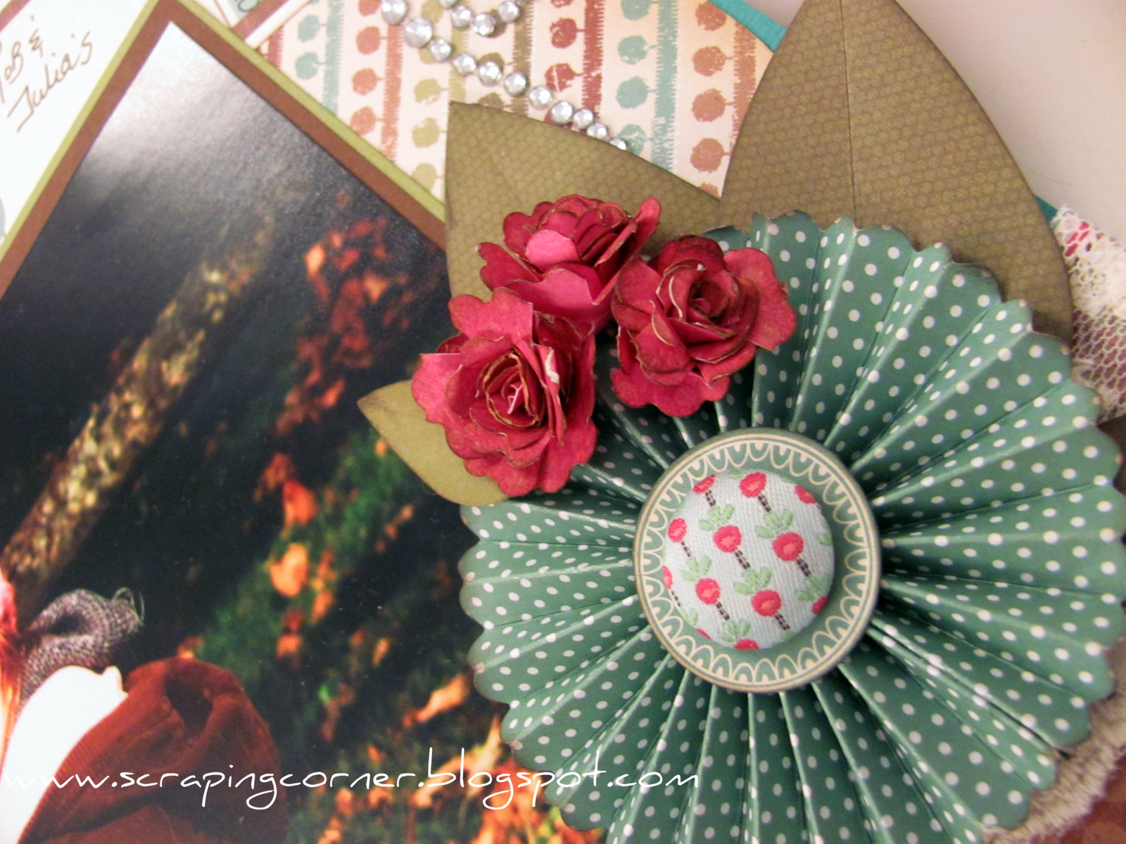
This month we go to work with an amazing line from Bo Bunny called Gabrielle - full of peach and browns and teals - and tones of butterflies.  Oh what a fan!  Although I must say I am looking forward to seeing the Et Cetera line in person - it totally looks my style.


Your Radiant Smile


Supplies :
Patterned Paper = Bo Bunny - Gabrielle collection
Buttons & Charms = Bo Bunny Gabrielle collection
Flowers = Prima, Websters Pages
Trim = Websters Pages
Stamps = Martha Stewart & Harmonie
Ink = Distress Ink by Ranger
Other = handmade flower - canvas & distress ink on a Glueber


Peek-A-Boo

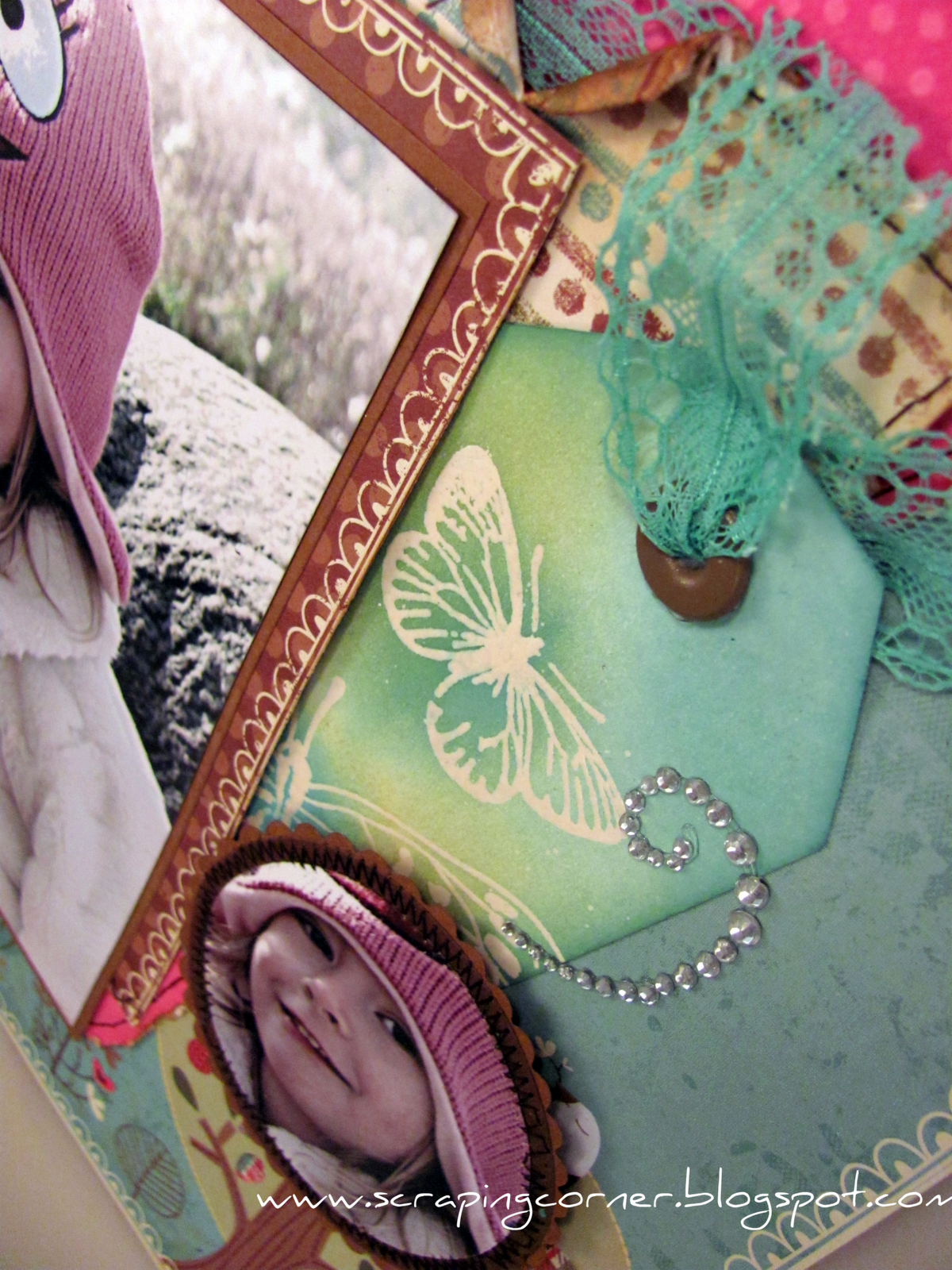
This photo was taken by my sister when she and my husband took the kids to the Tulip Festival in Ottawa earlier this year.  They are looking through the pillars to the Rideau River below.  What a great vantage point.  I colour washed this photo so that the bright colours in their outfits wouldn't detract from the rest of the layout.  I find that sometimes you need just a hint of colour in a photo, and don't want to do it completely Sepia.


Supplies :
Patterned Paper = Bo Bunny - Gabrielle collection
Buttons & Charms = Bo Bunny Gabrielle collection & Stampin Up
Flowers = Prima, Websters Pages
Ink = Distress Ink by Ranger
Journaling = my antique typewriter
Bling = dollar store


Be sure to check out the Auntie Em's Scrapbooking blog here, to see both Melissa's and my August Reveals!


Thanks for looking!

~Lorena~

Sunday, March 13, 2011

Circle Punch flower - tutorial

Here is a tutorial on a flower I have recently made - I've been calling it a "water flower" but it would more accurately be called a Circle Punch flower.  I was calling it water flower because you use a water mister to make the petals wet so they are malleable.

You will need:

- patterned paper or cardstock
- circle punch (I used 1 1/8")
- water mister
- distress ink
- stapler
- button for centre

Step OnePunch 7 circles.  Six will be the petals, one will be the base.


Step Two

Mist the 6 circles with water, then ink with distress ink on the edges.  Remember that Distress ink reacts to water, this gives a neat effect on the petals.


Step Three

Fold a pleat into each of the six moist circle petals and secure with a staple at the base of the pleat.

Step Four

Staple each of the petals onto the base circle.  Work in a clockwise fashion overlapping the previous petal.


Step Five


Create a centre to your flower.  You can use a large brad or I have used buttons with twine.


Voila, you now have a pretty little dimensional flower!

Let me know what you think - become a follower of the blog - I'm always posting nifty stuff :o)


Total Pageviews

LinkWithin

Related Posts with Thumbnails