side bars

Monday, July 26, 2010

Get Well & Thinking of You cards - from Scrapbook & Cards Today

There was a tutorial in the July issue of Scrapbook & Cards Today magazine for a card with a window and flower box on it that I quite liked, so here is my version. It's the one on the top (with the green arrow)


I used lots of stuff I had already, not sure on what the gingham paper was, but for the cardstock I used Bazzil Basics, the rub-ons and stamps are Stampin Up.  I used Tim Holtz distress inks as well.

The first up is a Thinking of You card.


Second is a Get Well Soon card.

Friday, July 23, 2010

CHA Summer 2010 - coming soon to a retailer near you ;o)

Well the web is all a buzz with sneak peeks for CHA (Craft & Hobby Association) Summer 2010.  This is when all of the Scrapbooking companies reveal their new lines that will be released over the next few months.  Think of it like Christmas in July for a crafter!

Here are a few seek peeks that I'm looking forward to...

Basic Grey: has five new lines coming out including one called PYRUS (yup like the pear variety)

The other collections are named:

Curio
Marjolaine
Jovial
Wander


Bo Bunny has an exciting new line called Cambridge - so excited to see that!

Webster's Pages has line coming out called Hollywood Vogue


Prima Marketing has a line called Annalee coming out - so pretty and very Victorian look to it!


Well that's it folks, we will have to wait until July 27th to see the rest of it ... exciting news in the world of scrapbooking :o)

Wednesday, July 21, 2010

First Sketch Challenge - The Results!

And what results they were!  Fantastic work girls! I must admit, putting a two hour time limit on it seemed a wee bit apprehensive at first - a might bit daunting actually.  But, I think it was just about the right amount of time.

There is still time for others to add their layout to the gallery - please email them to MailboxLorena@aol.com if you want me to include it. 

Please understand that I respect the privacy of others and their children and the web (being as it's world wide and anonymous), hence the reason for blurry faces and names.


Lorena's Challenge #1 (I kinda cheated, did this one at home)


Lorena's Challenge #2

Terri's Challenge

Mysti's Challenge

Carol's Challenge


Candace's Challenge


Monday, July 19, 2010

Sketch Challenge

I found a great website that provides Scrapbook sketches www.pagemaps.com  Becky Fleck - the designer is simply fabulous.

So the group of girls that I get together with every Tuesday to scrapbook will be working with the sketch tomorrow.  We have also put a time limit on the challenge of two hours.

If you would like to participate, simply email me your finished layout and I will post it on my blog!

Sounds like fun? I think so!

Sunday, July 18, 2010

Baby Shower - Brag Book & Card


I created this Brag Book as a gift for a Baby Shower that I will be going to this weekend.  The Mom-to-be knows that she is having a boy, so I did it primary colours (I would have loved to do it in soft pinks - I love pink)


I won't post this until after it has been delivered to the Mom.  I have also posted the accompanying card that I made.


I used October Afternoon's Thrift Store line paper and Inkadoo stamps which I watercolored. I also used some Stampin' Up papers.  You see the Mom-To-Be is a Stampin' Up Rep.  I think she will find the card funny.  I don't have a Baby Shower stamp, so I used a "Birthday" stamp and covered up the "DAY" part of it.  I think she will find it amusing :o)

Tuesday, July 13, 2010

Vintage paper - oooh what a find!

I had the absolute pleasure of a wonderful Yard Sale find on the weekend!  I picked up some very old books.  Three of which are old hymn books (with music notes and lyrics), and the fourth is an old medical dictionary. 

You may ask... why?  Why Lorena are these nifty finds?  Ah, my friends, when you add vintage text to your layouts - tucked behind a photo, scrunched up in a corner - under a clear button - as part of a flower etc. it makes for VERY interesting layouts!

I've been doing a wedding album recently and was able to sneak a few pieces of the vintage hymn book into it.  I won't be posting any of that album until it has been delivered to the owner, and only with her permission - sorry folks.  I will however be doing some more of my family soon, and try to utilize vintage text there too. 

I'll tell you one thing though.... 100 year old paper really SMELLS when heated - Pew - who knew!

Friday, July 9, 2010

Tri-fold cards - (tutorial)

Well I celebrated my 3rd wedding anniversary yesterday. That's right, I was one of those crazy people planning a wedding for 07-07-07! It was great actually, no problems, no delays, perfect.


I made my husband an Anniversary card - I did it in a new technique that I was trying out... I'll show you how I did it :o) It's called a tri-fold card, and it is SO SIMPLE to make; yet looks so damn cute and detailed.

Supplies;

You will need some sturdy cardstock a 12x12 sheet
A Bone folder, or ruler to crease your folds
A cutter that can cut in the middle of a page (I don't recommend a rotary cutter for this)
A scoring tool or you can use your bone folder again

Step ONE
Cut your cardstock at 5 1/2" (so you can make two cards from one piece of cardstock) 5 1/2 vertical x 12 horizontal.

Step TWO
Score vertical lines at 2 inches, 4 inches, 8 inches and 10 inches

Step THREE
Measure down 1 1/2 inches from the top and the bottom and cut from the 2 inch score line to the 10 inch score line.

Step FOUR
Fold the card into an accordion style.  The smaller top and bottom sections are folded opposite to the larger center section.  It is probably easier to look at the photo and try to follow it.

Step FIVE
Decorate the card - This is the fun part!

Wednesday, July 7, 2010

Avonmore Berry Farm - double page layout

This is a re-post of a layout that I did in June of 2010 - it has been published in Canadian Scrapbooker Summer 2011 issue (page 95)  My first publication - hopefully of many more to come!  Let me know what you think of this layout!

***********************  original post  **************************

On June 23rd this year friends and myself went to the local Berry farm to pick strawberries... there was a 5.0 magnitude earthquake that day!  Weird, yes, we never have (rarely) earthquakes... but what was weirder was the fact that we didn't even feel it!  We were in the middle of the field and I guess because you are 'one with the ground' and not in a building that is 'attached, or embeded' in the ground you don't feel the sway as much.  Either way, it was a really great spot for a photo shoot!  More to come of the kids picking/eating berries.


I used Basic Grey's Nook & Pantry for this, they have a REALLY great paper called Strawberry Shortcake that has strawberries all over it, and I just love the pink and red combination.  I bordered the whole layout with matching green.  I used various Prima flowers to layer also mixing in some tulle.  I included a little strawberry jam recipe - I thought it was cute. I glued on some lace that I had picked up from a local craft store.  The Lined paper is Grandma's Kitchen - Pen Pal, I used a small hole punch and tore through like it was pulled from a spiral bound book.  I used my Circut for the titles - fonts were "Cursive 101" for the Avonmore, and "Plantain Schoolbook" for the Berry Farm - I used the shadow feature for both. I used "George & Basic Shapes" for the circles, and a Fiskars punch for the scallop.

Monday, July 5, 2010

Embossing Relief (tutorial)

Hello again everyone, I'm very excited to show you this next project. I posted a link to a tutorial a few weeks ago regarding using embossing as a relief for distress inks.
Well, here is my version - hope you enjoy!


You will need:

      -  Versa Mark ink stamp,
      -  Clear embossing powder,
      -  Assortment of distressing inks,
      -  Heat resistant craft mat,
      -  Water in a spritzer,
      -  Stamp in the image you want to show through
      - Heat gun

Step ONE

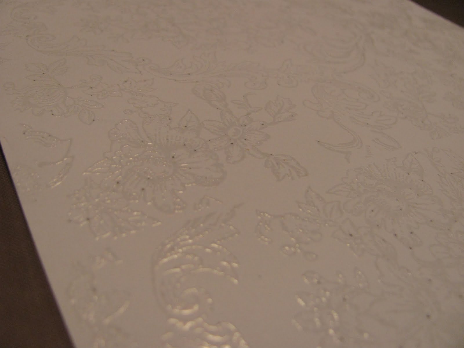
Stamp image onto paper with Versa Mark ink. This ink is great for embossing clear, as it is clear itself - but it is hard to see on the paper, so keep good lighting on hand :o)

Step TWO

Sprinkle the clear embossing powder onto stamped image - ensure you have full coverage. Use your heat gun to cure the powder.

Step THREE

Stamp directly onto the craft mat with the distress inks. My suggestion is to stamp the lighter coloured inks first so that you don't contaminate your ink with a darker colour. Distress inks are dye inks that have a unique property that when water is added they wick with the water without breaking up the ink's properties or colour.

Step FOUR

Spray the ink down with your water spritzer, until large droplets of colour form.

Step FIVE

Drag your embossed paper through the ink droplets, and dry with the heat gun again.

You can get creative with this and use more or less embossing, more or less distress ink, try different colours and images. Enjoy it! There are no mistakes in Scrapbooking, that's the beauty of it, you just add an embellishment :o)


Let me know your thoughts, and show me your results!


Follow my Blog!

Total Pageviews

LinkWithin

Related Posts with Thumbnails