side bars

Thursday, September 27, 2012

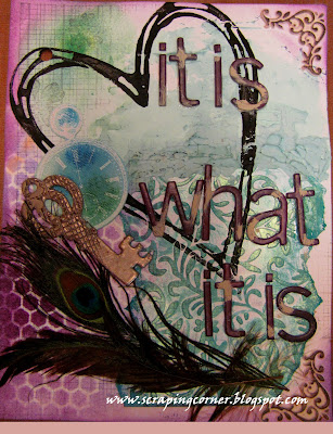
Art Journal - pages 2 and 3

Continuing on with the Art journal project I have started.  I am going through some very difficult times right now personally.  Someone very close to me is dying, and it is hard to watch.  And while everyone dies sometime, you just never 'want' it to happen.  And when someone starts to fade then you try to hang on to the hope that they will somehow get better, and all things will be the same as they once were.

This journal is intended to help me get my emotions out, page by page, as things unfold in this journey I am documenting them in art.  I use to write poetry, I was pretty good, I have been published a time or two.  But life changes you, and your interests and way of expressing yourself either matures or digresses, I don't know which.  But this is how I'm doing 'me' right now.
 
Page two - As much as I hate this saying, and believe me I do ... "It is what it is"  It is just that ... it IS what it is ... and you can't change it.  It ... is ... cancer.  It ... will be ... death.  Moving on ... notice on this page the key?  That was a cool technique, I used Versamark and platinum embossing powder in several layers then while the heat embossing was still hot, I pressed a rubber stamp into it - love how it turned out.

Page three - I'm so sick of hearing this right now when I tell anyone what I'm going through "Oh, I'm so sorry to hear that"  Really? Is that just the stock saying?  I know it's probably the same thing I would be saying if I were in their shoes too, but honestly, does it really benefit either the recipient or the giver?  Anyway, it is what it is, and until it's over, everyone is going to be sorry to hear that.  Moving on again, the technique in this one is my hand made flowers.  And again having used Gelatoes to colour the background.
 
 
Well as always, I appreciate your comments - be kind and leave a few words for me ... simply click on the comment button right down there :o)
 

Monday, September 24, 2012

This & That - A Fuzzy Friend

Echo Park papers have really started to grow on me over the last year.  I loved the This & That line in the boy theme, and I'm also loving this girl themed one too!  I had some amazing shots of my daughter playing with a caterpillar that was wandering in our yard, so I put the This & That to good use.  Using an abundance of Prima flowers and embellishments; some paint splatter (some not very successful I may add); some Glimmer Glaze drips; and finally using some Bazzil Paper Tape.  I'm not sure I'm all into the Washi tape craze yet ... I understand it's versatility, however I have doubts that it is going to withstand the test of time, I think it is going to dry out and peel off when all my photos and flowers remain stuck.  We shall see, I guess.


Let me know what you think!  If you would like to see this layout in person it is on display at Auntie Em's Scrapbooking in Cornwall.


Saturday, September 22, 2012

Beautiful Moments with Carta Bella

I stopped at Marchant Paper Memories in Kingston on one of my multiple trips back home in the last month.  I picked up some Carta Bella papers - this is a spin off company from Echo Park.  Since Auntie Em's Scrapbooking doesn't carry Carta Bella (however after this review Emma just might consider it *wink wink*) I must say, I was pleasantly surprised with the quality of Carta Bella - the texture is amazing, and it is ultra thick paper.  I love the Beautiful Moments collection.  I'm always drawn to any collection that pairs red and pink together (successfully). 

I have done two layouts with this line already, and have enough left overs for at least two more or a hockey sack full of cards, which I may do ... I think this paper would be perfect for valentines cards, and if any of you remember I have a tone of Magnolia valentines stamps ... and now that my daughter is in school, I might end up making valentines - such a sorry excuse of a holiday - bring on Christmas!!


I used some paper clay on a chipboard bird as and embellishment, coloured with Copics.


Five at Four


The title for this layout was inspired by a layout I saw years ago on Scrapbook.com ... I wish I had a link to it, but it was titled "7 at seven" and was 7 things about her daughter, I believe it was a digital layout ... whoever you are - I would love to give you credit for this, but alas I did not keep record of your amazing layout :o(  Thank you for the inspiration!

Well there you go folks - and Emma - just a hint - you would like the Carta Bella papers too!!


Friday, September 21, 2012

Prima Sunkissed - and a BOY layout

OK, so I catch a lot of grief for not scrapping my son as much as I do my daughter ... I'll admit, I love pink, I love flowers, and I am attracted to the girly papers.  That being said, I had this amazing shot of my son hugging a sunflower... and yes, he did indeed 'hug' the sunflower!  I entered it into the local fair and it did not win a dang thing ... I guess it was just funny to me.  I have used the Sunkissed collection here - it was chalked full of sunflowers paired with blue ... perfect for this photo!  This layout is inspired by Jamie Daugherty - it's damn near scraplifted actually ... I love Jamie's work - she is a fantastic artist.  You can check out her blog HERE and you can check out the inspirational layout on this YouTube video HERE.


Well there you have it folks - a boy layout with tones of flowers and on very 'girly' paper .... wait until he is old enough to realize what Mama did LOL!!

Enjoy!


Wednesday, September 19, 2012

Auntie Em's September challenge - Hello Fall by Little Yellow Bicycle

One of the two favorite seasons in my home is fall (the other is spring) we love the warm "second summer" that you get in late September or early October, and love the pumpkins and the beautiful leaves turning colour. This month Emma challenged the Design Team to make their own titles, and while I typically will use my Cricut for something like that, I decided to use a cut out and hand write the remainder of my title. I don't do enough journaling on my pages. The sketch was very circular, and since this paper from Little Yellow Bicycle had the perfect pumpkin orange in it, I decided to make a pumpkin out of one of my circles.
I managed to squeeze out a second layout out of the leftover papers - this one was not based on the sketch. I entered it in the Newington fair and received a blue ribbon (that's 2nd place for us Canadians!) I was very pleased how this layout turned out.


If you would like to see either of these layouts or any of the others that you see on the blog in person they are all displaying proudly at Auntie Em's Scrapbooking in Cornwall.
You too can play along with this challenge, create a layout using product purchased at Auntie Em's based on the sketch from Scrapbook & Cards Today calendar (September) and your challenge is to make your own title! I can tell you that the prize from last month was amazing - over a $45 value!!! Who knows what Emma is going to give away this month, you still have two weeks to bring in your layout - you can't win if you don't play!


Monday, September 10, 2012

Life is Finite ...

I've finally decided I am going to take up Art Journaling ... well kinda.  Mixed media art is everywhere now, and it's so intriguing, however there are alot of elements that I don't like about it ... and I have finally got my head wrapped around the fact that I don't have to do those things that I don't like, I can make it me, I can do it however I want.
This was my first ever Mixed Media attempt

So, the other day I did a couple of little canvases, and enjoyed the journey.  See above for my first attempt (shudders) I can't believe I'm putting this on the blog!

Today I got some bad news about a family member and something has been running through my head like a mantra all day ... Life is Finite.

I used a canvas page from the Prima Mixed Media Album, and a book page, gesso, texture paste, Crafters Workshop template, stamps from Prima and Autumn Leaves, Prima flowers and bling, bubble wrap, pan pastels, and gelatos ... wow what a mix!  I guess this is why it's called MIXed media LOL.


Anyway, first attempt, let me know what you think


Sunday, September 9, 2012

Heat Embossing on Vellum - Tutorial

 Heat Embossing on Vellum

Never under estimate the power of VELUM. One of my most favourite things to do is heat emboss on velum using my printer.I have an ink jet printer and with it I can print in any colour, unlike having to own several different colours of ink or embossing powder you can print out in any colour you like.

Printing on velum can be a little messy, remember that velum is a plasticized paper and therefore the ink will sit on top of the paper for a little while longer than standard printer paper.Once you have printed the velum, immediately cover the image with clear embossing powder , shake off the excess and heat.

Because there is so much ink sitting on top of the velum you get a very raised embossed image.I also like to use a metallic embossing powder for a metal look; add a little bit of distress ink and you have a tarnished metal look.

Use Versamark clear ink and clear embossing powder with a snowflake stamp for a subtle image that is sure to catch a few eyes.

Ingredients:
  • Ink jet printer
  • Velum
  • Clear embossing powder
  • Heat gun
  • Metallic embossing powder (optional)
  • Stamps (optional)
 Not shown here is my Ink Jet printer

Versamark clear ink, stamp, metalic embossing powder
Versamark ink, snowflake stamp and clear embossing powder


I printed several images with the Ink Jet printer - they are WET


Cover with clear embossing powder, shake off excess and heat emboss


Friday, September 7, 2012

Spiral flowers tutorial

 Paper - Scissors - Ink & Glue! (Spiral flowers)

 
If you are like me, I just drool over the pretty flowers that all those big names sell. I love how dimensional they are, how pretty they look.

Here is a quick tutorial for a flower bud that doesn't require the use of any die cutting machine. Infact all you need is Paper, Scissors, Ink and Glue!
I have so many of those decorative edge scissors hanging around, I rarely use them any more, but here is a chance to use the one that looks like a scalloped edge.


Directions:1. Stamp any image onto a sheet of cardstock. Here I used a text based stamp.
2. With the scalloped scissors cut circle shapes. About 1 1/2" in diameter.
3. With the scalloped scissors cut the circle into a spiral. Keep the edges about 1/2" wide.
4. With regular scissors cut slits in between the scallops.
5. Ink the edges of the scallops and on the slits.
6. Using your fingers or a pair of tweezers, start at the middle and spiral in.
7. Keep rolling inwards until you have a tight flower 'bud'
8. Glue from the underside, hold until set.
9. Open the flower petals outward by pulling back the outer parts first.

Here are some photos to help you out. Let me know what you think?


Wednesday, September 5, 2012

Gift Card Holder - Tutorial

I love to create my own handmade gifts for my loved ones at Christmas time. However there are some you just don't know what to make for. That's when I give gift cards so that they can buy what they would like!
So, here is a beautiful gift card holder that I designed to look like a wallet.


I used my Big Shot to dry emboss a leather grain onto some white paper (8 1/2 x 4 1/2) so when it is folded it is almost square.


I then used two different colours of distress ink to give it a worn leather look.


I covered the whole paper with clear heat embossing powder and heated it to give a very shiny look to it.


I cut strips of paper of different heights for pockets to hold the gift cards.


I hand stitched the edges for a more authentic look.


Added a ribbon and 'hitch ball' closure.

Total Pageviews

LinkWithin

Related Posts with Thumbnails