side bars

Tuesday, December 28, 2010

My new toy!!

Well I'll tell ya, Christmas was great this year!  My husband bought me a new toy .... do you know what it is??


I also got a new scrapbooking box, an I-rock, and a mini sewing machine.  I think I may still buy a semi-decent new one for myself.  Not sure if this little one is going to do the trick or not, but we will see.

I also made a new card, this comes directly inspired from a card that was sent to my sister for Christmas from her friend Rae-Lynn in B.C.  I loved the card so much I asked her if I could 'lift' it!  She sent me a link to a blog post tutorial on this card - here is that link http://www.stampingvideos.com/2008/10/origami-christmas-trees.html

That's it for now folks, let me know what you think of my new toy ... leave me a comment as to what you believe it is!

Monday, December 20, 2010

Stampin Up Starter Kit Cards Contest

I made these two cards for a contest going on at Stampin' Up. You have to use ONLY the contents of your starter kit. It seems as though there is a lot of controversy over that though. I guess the kit has changed over the year, and others didn't know that you could customize the kit to contain patterned papers and ribbons ... well I figured it out, and I must say that I think I did alright.  They are picking five winners and each winner will get to pick a stamp set ... how cool would that be? 

I tried to throw a few techniques in there too.

For my first card, I distressed up the edges of the paper, I used my scissors on this one, but normally I would have used my Tim Holtz distresser (which Stampin' Up does sell, however it didn't come in the kit)  I also used my Chocolate Chip ink refill to dye my lace ribbon.  And as you know I love to ink the edges of absolutely everything, so I used the sponge that they provided in the kit. The colours I used are More Mustard and Chocolate Chip and the stamps that I used are from Word Play and Sense of Time collections.


The second card - and my favorite of the two - I used an embossing relief technique and my brand new Stampin' Wheel - loving that thing!  I used again the More Mustard and Cherry Cobbler this time.  What a combination I know!  After embossing with clear embossing powder and Versa Mark ink, I put the More Mustard ink on my craft mat and sprayed it down with water and ran the card through that.  After allowing it to dry I sponged on some Cherry Cobbler ink into the spots that were shy of ink for a little depth.  I love the way it turned out.  Then I used the Elizabeth stamp and two stamps from the Vintage Vogue collection for the sentiment.  I tore spiral circles and inked them for the flowers.  I will do a tutorial on spiral flowers soon on my blog; they are fun and easy to do. 

Thursday, December 16, 2010

Christmas cards & Vintage Tags

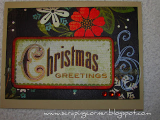
So ... what have I been doing with my time recently you ask?  Well I've been making all my Christmas cards, and tags ... I'm too cheap to buy them LOL!

I used a Basic Grey card kit and made a few of my own from the Jovial line.


I made my tags with my Cricut using the Plantin Schoolbook Tag1 at 3 1/2 inch and used a Bo Bunny stamp with Tim Holtz Distress ink in Peeled Paint, then distressed the outside with Worn lipstick distress ink.  I stamped with a Hero Arts snowflake using Stampin' Up Craft in in Whispter White and finished it off with a piece of twine for the tie.

I hope you enjoyed these.

Wednesday, December 8, 2010

Echo Park - Merry Christmas - stocking

Well hello there! 

I got the chance to work with the new Christmas collection pack from Echo Park - Merry Christmas.  I just love the traditional colours of mossy green and deep russet red, when they threw in some chocolate brown I was ... well, tickled pink!  I absolutely adore the music sheets there are in this collection.  I have so many plans for them. 

In the meantime I put together this little stocking project.  With a little gingerbread man escaping down from a dangling ornament. 


I created the stocking with a blanket stitch all the way around the perimeter and added the toe and heal in a contrasting green polka dot, and used a crimper on some plain white cardstock to add some texture for the top. 

I couldn't find a perfect match to the mossy green in the stickles that I had, so I mixed bronze, green and black together and painted it onto the edges of the holly leaves.  I added some red stickles and red gems to the berries of the holly. 

I used Glossy Accents on the candy canes to give them a shine like real candy.  The gingerbread man is traced with glitter and accented with brads for his eyes and buttons. 

I wanted to make the Christmas ornament pop, so I used a technique that I've done before when making pumpkins at Halloween, by cutting strips of patterned paper and gathering at the top and bottom with a brad and then spreading the strips apart to form a half ball.  This technique works well with ribbon too!

Thanks for looking and come back any time!

Wednesday, November 24, 2010

Stampin' Up .... New Demonstrator!


Well ... I couldn't pass up the deal that Stampin' Up has on until the end of the month.  Half price starter kit!  I was really interested in the Digital portion of the kit, but I opted for the 'regular' kit as the Digital Studio is on sale right now too.
If you haven't had a chanhomece to check out what is available with Stampin' Up take a look at their website; http://www.stampinup.com/ca/enc/default.asp
I will be starting a second blog that is for JUST my Stampin' Up stuff.  I'll put a link to it on this blog too.
So, that being said, I will be doing a card class very soon in the Cornwall area, so if you are interested jot me an eMail and I'll put you on the list! MailboxLorena@aol.com  We will be doing 3 cards, and the cost will be a mere $5.  However, if you place an order, I will waive the $5 class fee!  Think about it, could you even purchase ONE greeting card at Halmark for under $5?  This will be 3 handmade cards - made by YOU! 


Saturday, November 20, 2010

This is Me @ 35 - layout

Yes... it's true, I'm 35 ... YIKES!  Well I don't scrap often photos of myself. 

I fell IN LOVE with the Prima paper line called Annalee ... just loved it.  It is funny that is my Sister's name, and when I showed her the line and told her that I would be doing a layout of her in these papers she said "but it's flowery and pink" and since you don't know my sister, she is anything but a pink and flower lover.  But then again, she's not a scrapbooker either ... so ... I can do her pages any way I want to, right? ;o)

I used an Annalee pebble on this one as well, and some trim that I had in my stash as well as some Bo Bunny Chiffon Rose Trim.  The "35" were dollar store chipboard numbers that I added Crackle Accents to and then inked them.  The pink rosebud flower I made with some ribbon and my sewing machine (didn't turn out as nice as I had hoped)  The vine is Prima as well.  I might just submit this one to Prima and see what they think ... who knows eh?

Have a wonderful scrappy day and let me know what you think in the comments section.

Wednesday, November 17, 2010

Sketch Challenge - my take - Innocent Youth - layout

I had so much fun with this sketch, thanks Mandy for making it so easy with an awesome pick from Becky Fleck's PageMaps.

I used Basic Grey's Bitterweet colletcion and The Basics.  An OLD Prima bloom that I have had so long I forgot I had it, and I put together the little one with some Bazzil and Prima and a brad.  I used a croched flower that I picked up at the fabric store in the $0.50 bin, and my Martha Stewart border punch.  I'm not big into journaling so I used one of the element stickers from the Basic Grey Bittersweet collection too.

Can't wait to see what Mandy has in store for this challenge!


The journaling reads: She finds joy and fun in the most simple things in life!

Sunday, November 14, 2010

Oh I love a Challenge!

A sketch challenge that is!  Mandy has officially challenged this scrappy girl with a sketch challenge ::rubs hands together::  Oh, this is going to be fun!

She suggested one of Becky Fleck's Page Maps from November.  I am a huge fan of Becky Fleck to start with so I was all over this challenge!

So, here is the sketch ...  if you want to join in, you are welcome to, just eamil myself your finished project. MailboxLorena@aol.com

Remember with a sketch you can flip, turn or rotate the sketch any way you desire as long as the original sketch is still recognizable.


Have fun with it, and I hope you enjoy the ride!

Tuesday, November 9, 2010

Mandy did it! She's now a Blogger!

Kudos to my friend Mandy who got her blog up and running!  Congratulations on a job well done too!

Mandy is a proud member of two design teams; Sandy's The Work Shop and Let's Scrap and I'll tell you I'm proud to say she is a friend, I admire her work.  I can say with full honesty though that her style and my style are as we put it "polar opposites"

Stay tuned for upcoming challenges between Mandy and I on our blogs and maybe even some blog candy!

Take a moment to hop on over to her blog Remember When ... Scrapping My Doodlebugs

On another note, here is a layout that I did - quick and easy, of my Halloween pumpkins.


Here are a couple of older layouts that I did two years ago.


Monday, November 1, 2010

<~~ is a winner!

OK, so on my day off, and while the kiddies were napping I thought I could bang off a few Christmas cards, which I did ... but I also participated in a UStream online tutorial from Prima Marketing.  The facilitator, Julie, was making necklaces and I they were giving away prize pack to a lucky participant.  Well, I didn't even know they were giving anything away.  I was just so taken that there was a live tutorial going on and I could be a part of it by asking questions and getting an immediate answer!  My husband called home right in the middle of it, I told him what I was doing and he called it Porn chat for crafters... he doesn't know I won the Prima prize yet :o)


For the cards I used Bo Bunny's Winter Joy line... I love purple and blue for Winter layouts and cards.  The sentiment is a Sampin' Up stamp.

Thursday, October 28, 2010

I Love Summer with you - layout

I did this layout of my husband and our son with more of the papers that I got in my kit from Tina's Scrapbooking.  I think this will be my last layout though, I don't have any full sheets left :o)

I started with a 10x13 print of my photo and croped it horizontally so that it would be the entire width of the 12 inch page.  I kept the paper simple to not detract from the photo (that coupled with the fact I have very little left of this kit :o) I added a few pinwheels - really liking them right now.  I used the Cricut to cut the "summer" title using the Stretch Your Imagination cartridge, and Street Sign for the "you" part.  I used my Dymo label maker for the rest of the title. 

So, I'll be off to Winchester tomorrow to deliver my final project to Tina.  Be sure to stop by her store and cast your votes for your favorite layout or project! 

Enjoy and happy scrapping!


Wednesday, October 27, 2010

Got some HUGE news to share!


Guess who is going to be a part of the Design Team for Posh Design Scrapbooking Store? Oh yeah, that would be me :o)  So very excited about this.  I love Nini's store, it's so well laid out, has alot of product, has alot of exposure and is very coveted!

Here are a couple of projects that I have been working on for her site.
First up is a layout that I made with my one of my most favourite lines from Basic Grey; Origins.  I've used papers from this line again and again, they are just so versatile.  This is a series of shots of my son when I was blowing bubbles towards him.  At first he didn't know what to make of it, then he started laughing and loving it.  Unfortunately the bubbles didn't turn out very well on the photos, so I made some of my own.  I cut circles out of velum and put icicle stickles over them.  I also used icicle stickles right onto the page.

The journaling reads: With his eyes full of wonder, Nigel's first encounter with bubbles, June 2010

Secondly I did two cards for Posh Design.  I used my all time ever favourite line from Basic Grey; Sugared.  Perfect for a baby girl.  I just happen to be going to a baby shower where the Mom-to-be is having a girl!  How perfect!


Let me know if you sense a theme in both these cards and the layout .... that's right, circles!

Lastly, I did a card from the new Basic Grey line; Jovial.  This card is from the sketch last week, which I was too late to get in on with the Design Team.  But I thought I would do it anyway.

Looking forward to working along side some VERY talented girls over at Posh Designs - be sure to check out their store!

Monday, October 25, 2010

Splendorous Fall - Layout

Another layout from the seasonal collection pack purchased at Tina's Scrapbooking Creations 


The journaling reads "Family time together at a little roadside Farm south of Ottawa, October 2008"

Hard to believe that it has been two years already, so much has happened since then! Not only has my Daughter grown up into a Terrible Two Year Old, but I have my Son hot on her heels.  Time flies far too quickly.


Enjoy the layout!

Friday, October 22, 2010

Posh Design Scrapbook Store - Challenge #18

Not that I can really enter into this, but I wanted to show off my card anyway.

I used Basic Grey's Jovial line for this card.  Be sure to check out Posh Design Blog and site for great challenges and awesome shopping!

Tuesday, October 19, 2010

Tina's Scrapbooking Creation kit - First Autmn - Layout and four cards

So, one of my local scrabooking stores; Tina's Scrapbooking Creations puts out a seasonal kit, where it is a mystery as to what is in the kit until you buy it.  Well I did ... and here is what was in the package:


Bella Blvd - Sunny Happy Skies - Creamsicle Clouds (2)
Bella Blvd - Sunny Happy Skies - Magic In The Sky (2)
Bella Blvd - Hello Beautiful - Cute Cuts (2)
Bella Blvd - Hello Beautiful - Border N' Blocks (2)
Bella Blvd - Hello Beautiful - Alpha + Bits (1)
Cosmo Cricket - Nutmeg - Falling Down (2)
Cosmo Cricket - Nutmeg - Autumn (2)
two pieces of Bazzil textured cardstock - in a mossy green and a brick red
12" of red polka dot ribbon
3 apple brads


I stared at this collection of fall colours, and very playful and cheery papers... wow, hmm... what the heck do I do with this? Now if I were my friend Mandy, she would be all over this, scissors snipping, glue droplets everywhere, paper scraps just a flyin' ... she loves Bella Boulevard and Cosmo Cricket ... again, this is VERY outside of my box. But I love a challenge.


The journaling reads: Vanessa pease don't put the leaves in your mouth ... ah yuck, dirty, dirty! Ah, you don't know what has  pooped on those leaves!  Out of your mouth, don't eat them! Daddy, will you stop her please?   .... Famous last words for baby's first Autmn.  ... from Mom


Well I started on the layout and then went to some cards. You see with Tina's kit, you can enter as many projects as you can make with the kit, as long as you are using the kit and not adding your own stash. I still have enough left over to do at least two more layouts.


Saturday, October 16, 2010

Summer - Layout


I totally challenged myself to create something with Echo Park's Sweet Summertime and A Walk In The Park lines.  When I was looking at these papers at first I thought to myself - now how in the world am I going to use these?
I had a definite case of the Scrapblock!  So, on my weekly scrapbooking night at my friend Candace's house she was doing this layout, and asked me to join her.  Not sure where this layout came from, but I did an almost total scraplift!  I loved the original that much!  I do know that the original had October Afternoon's Thrift Store in it too. 

The journaling reads: What a beautiful July day; oh so perfect for raspberry picking. Vanessa loved it. July 2010
So bright, so colourful, so outside of my box! 
Thanks Candace for pushing me a little!


Monday, October 11, 2010

Snack break anyone?

Everyone has something that keeps them going - creative fuel.  The desk-side snack.  For some it's chocolate.  Others it's ju-jubes or cookies.  Well I was noticing on my scrap table that I'm running low on my my favorite snack; chocolate covered sunflower seeds.  Then I had an idea for a post.... what do you snack on?  What can you not live without when you are stuck for creativity or that after dinner necessity munch?
For me, normally it's something salty, I've never really been a sweets kinda gal.  But I find that Ruffles Regular chips and my inky, gluey fingers don't really mix well.  So I tend to lean towards the chocolate covered sunflower seeds.  Water is always a staple on my desk too, I can't do without it.  I don't drink pop or anything like that.  I do enjoy the Pringles STIX too though, honey butter flavour - yumness!

Let me know what your desk-side snack is?

Saturday, October 9, 2010

Ohhh .... it's BACK!!

The Basic Grey Gallery that is!  So excited over this.  I loved it before and now it's even better!  And whats even more exciting than that, is that they are giving away collections packs! Every day BasicGrey will be doing an Upload Drive Giveaway for the next two weeks from October 14th to 28th! Every day BasicGrey will pick one project and will offer the designer a free BasicGrey Collection Pack, or $20 gift certificate for BasicGrey.com.

So, check it out BasicGrey.com/gallery

Monday, October 4, 2010

Monday's Child - layout

Monday's Child is fair of face,
Tuesday's Child is full of grace,
Wednesday's Child is full of woe,
Thursday's Child has far to go,
Friday's Child is loving and giving,
Saturday's Child works hard for a living,
But the Child who is born on the Sabbath Day
Is Blithe, winsome, happy and gay

I did this LO of my daughter, she was looking pretty darn cute with that flower in her hair.  I used Bo Bunny's Jazmyne line for this one, made my own flowers again. 

Thanks for looking!

Wednesday, September 29, 2010

The Best GIFT Under The Tree is YOU - Layout

I can't say enough about the Basic Grey's Jovial line ... there is so much going on with it!  So, for this layout of my daughter's first Christmas shot, I used a few different pieces of the Jovial line.
I cut out some of the Christmas tree balls and gifts from "Christmas Tree" and "Nipping", as well as used my Cricut (Christmas Cheer cartridge) for the tree itself.  I used a Martha Stewart punch and "Nipping" again for the borders.  I used my paper crimper to run the wire through for the garland.  I used my Cricut again for the star (George font) and folded it to give it some dimension and used some red and gold Stickles.   For the frame I did some water distressing on "Nordic".  My title a hand wrote mostly and used the Cricut (Blackletter font) with "Coal" and "Flannel Pajamas" I did some heat embossing for the swirls, used a Scrap FX wooden cutout of the dove, and a Prima butterfly.  One of my handmade corsage pins, a vintage button, and some ribbon trim.

I hope you enjoy this!  It sure was alot of fun!

Let me know what you think, leave a comment.  Become a follower (it's the 'IN' thing)!


Thanks for looking.

Monday, September 27, 2010

Joy To My World - Layout


Ah ... finally get to scrap with Jovial from Basic Grey - have I mentioned how much I love Christmas? I start thinking about Christmas in about August. I just love it! I drive my husband crazy with the fact that the Christmas tree has to be up BY DECEMBER FIRST!

I used the Jovial collection from Basic Grey along with Holiday Poinsettia from Prima, Jovial glazed brads, a Prima pebble, the Christmas Cheer cartridge on the Cricut for the holly leaves, a Prima stamp for the embossed tassels. I used the sheet music from Joy to the World from a vintage hymn book. Some Kaiser bling and red stickles.

The photo is my son when he was almost two months old in 2009.


Enjoy! And, thanks for looking!


Total Pageviews

LinkWithin

Related Posts with Thumbnails